Hey there,
it’s great to have you here!
Hey there,
it’s great to
have you here!
Portfolio 26
Portfolio 26

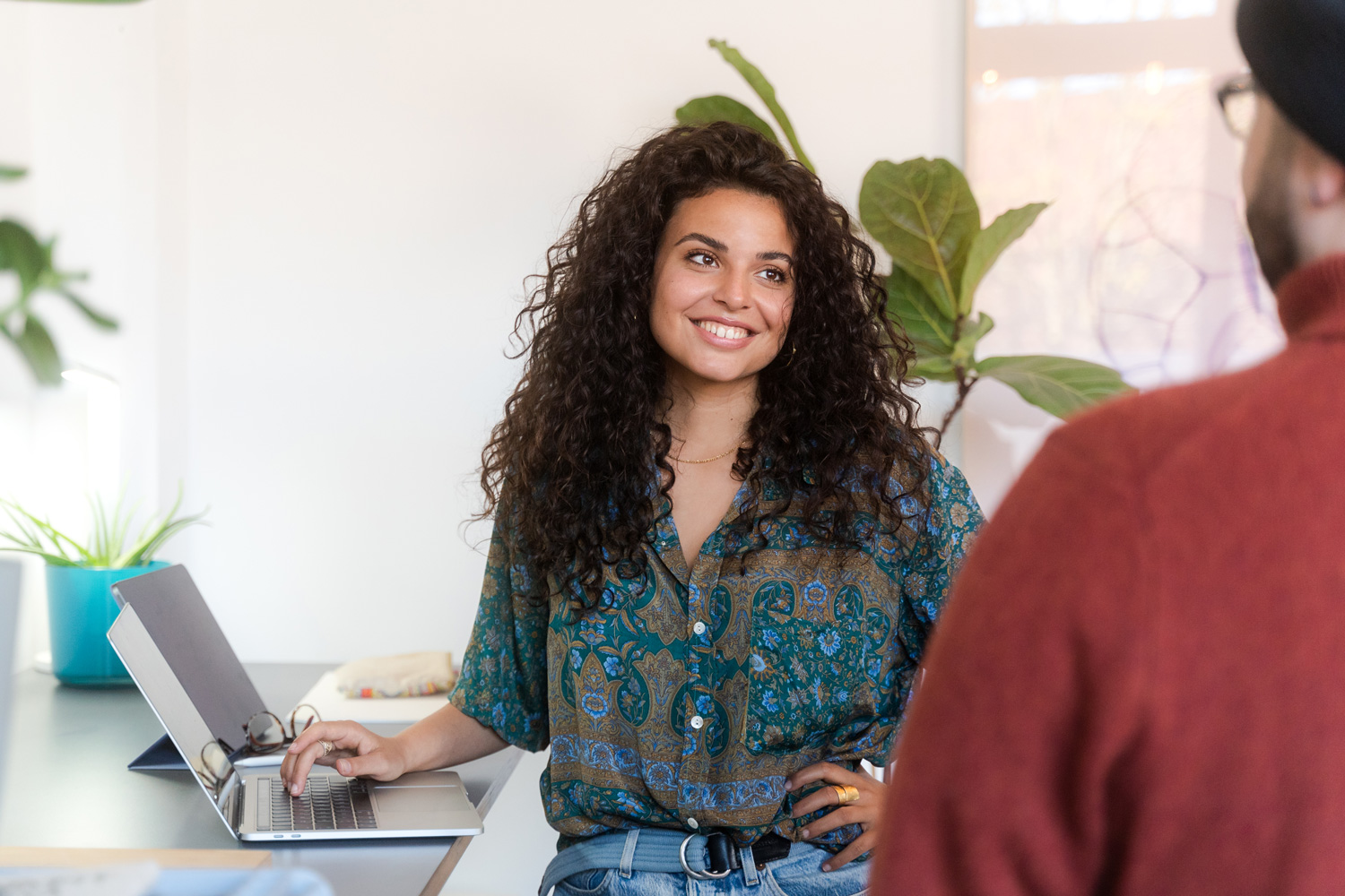
Welcome
I’m Francesca
I am Francesca Fabian, a UX/UI and brand designer whose expertise stems from a unique combination of over 5 years of experience: I combine the strategic depth gained from freelance and agency work with in-depth in-house expertise in the B2B tech sector.
My aim is to deliver holistic brand identities, from strategic conception (M.A. Design Research) to pixel-perfect digital implementation.
My strength lies in digital cross-competence: I guarantee brand consistency through precise art direction, master UX/UI design and seamlessly integrate brands into web platforms.
Alongside my work as a UX/UI and brand designer, I’ve been a visual artist for many years. My artistic practice is deeply personal, exploring lived experiences, emotional expression, and spiritual themes. I’m currently building an online shop to share my work more widely.
Vision & execution

10/2022 – 12/2023
Master Design Research
ELISAVA, Barcelona
Design research, Qualitative & Quantitative Research Methods, User Interviewing & Survey Design, Usability Testing, Heuristic Evaluation, Ethnographic Research, User Journey Mapping, Persona Development, Competitive Audit, Evidence-based Design, Cognitive Psychology in Design, Inclusive Design Frameworks
09/2017 – 08/2021
Bachelor communication design
Folkwang UdK, Essen
Communication design, branding, corporate identity, user experience/user interface design, design thinking, creative coding, editorial design, illustration, animation, photography, image editing
08/2023 – till today
Brand Designer / UX/UI Designer
CAS AG, Hamburg
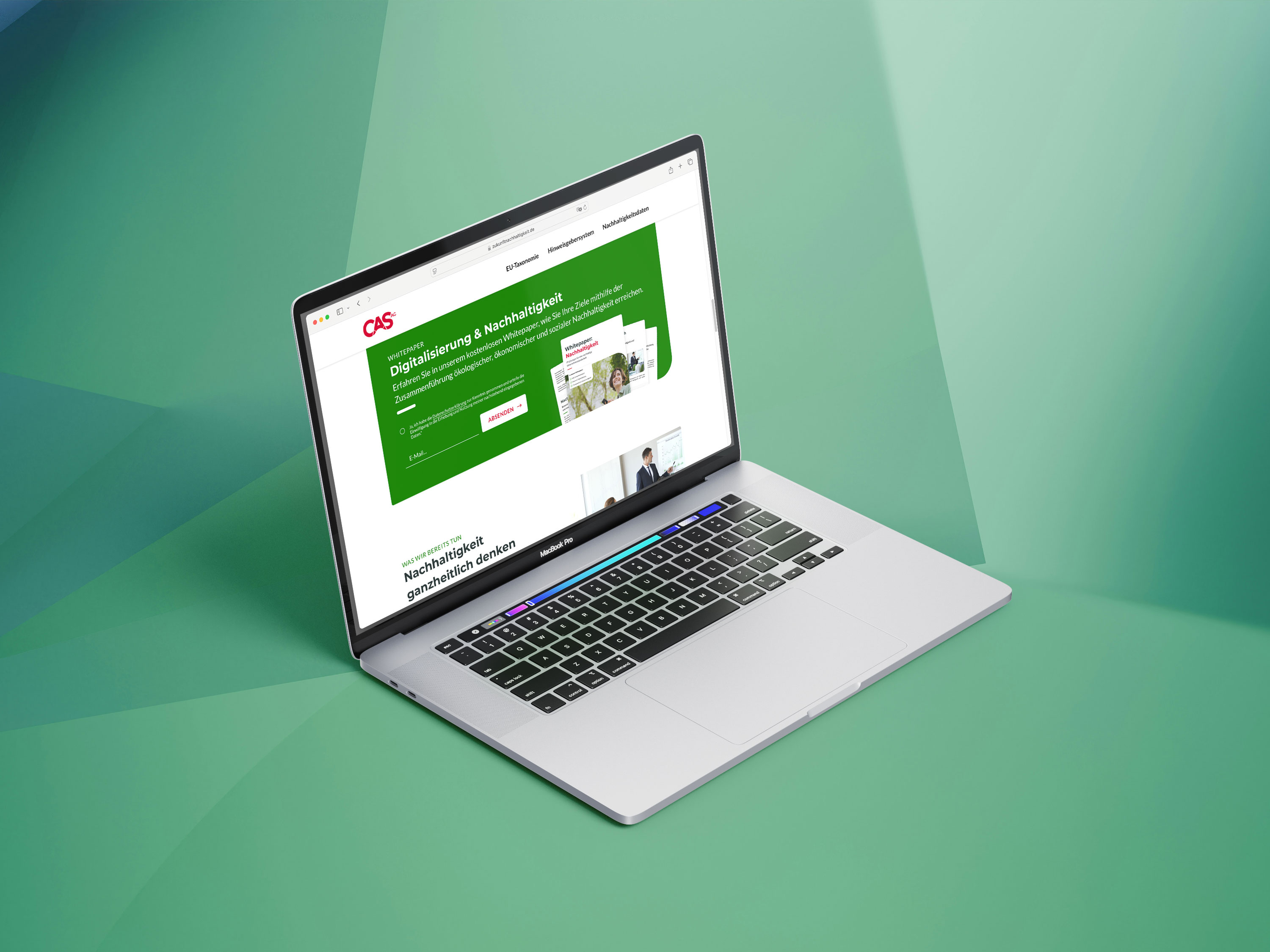
Led UX/UI, branding, and web design for the corporate website of CAS AG, driving a 50% increase in search visibility and achieving consistent top Google rankings (avg. position 1.3) through improved UX, content structure, and SEO.
02/2021 – 08/2023
Communication Designer
CAS AG, Hamburg
During my time as a communication designer at CAS AG, I was responsible for developing a consistent visual strategy. The focus was on combining the needs of different industries, aligning internal stakeholders and translating complex IT issues into visually appealing and understandable formats.
05/2020 – 01/2026
Brand Designer, Freelancer
Alimonie, Düsseldorf
At Alimonie Design, I developed interdisciplinary visual concepts that combined design, film, photography and web. Through close collaboration with clients, we created brand experiences that were both aesthetic and functional.
05/2020 – till today
Brand Designer/ UX/UI Designer
self-employed
With my expertise in strategic branding, UX/UI and design thinking, I lead the development of human-centred brand identities, from concept and visual system development (logo, typography, brand voice) to art direction and the launch of responsive websites.
06/2016 – till today
Visual Artist
In addition to my design work, I am also active as an artist in the field of digital painting and have had solo exhibitions in Cologne, Barcelona and Bochum. This creative practice helps me to think differently, see differently and design boldly.
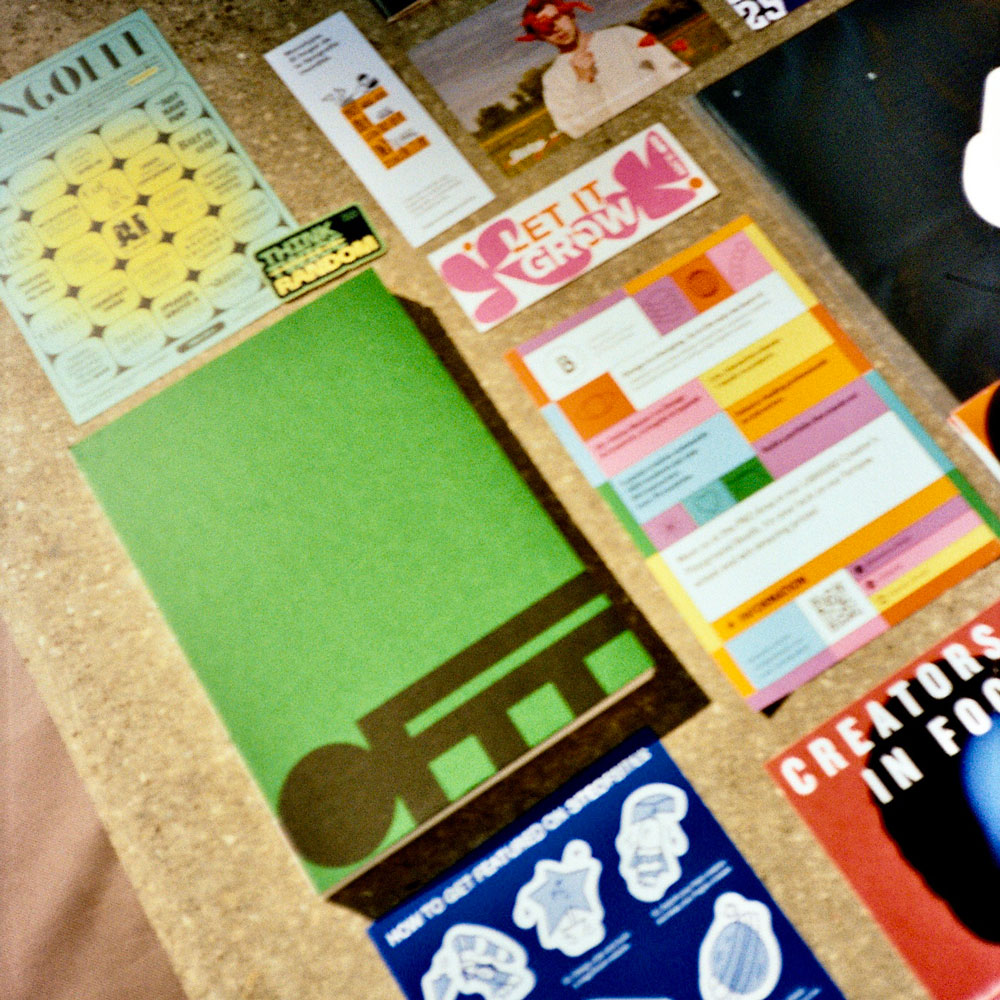
work samples
My freelance work is a targeted mix of case studies and strategic branding and web projects for young entrepreneurs and self-employed professionals.
I always follow the holistic product development lifecycle, working closely with clients to guarantee sustainable results.
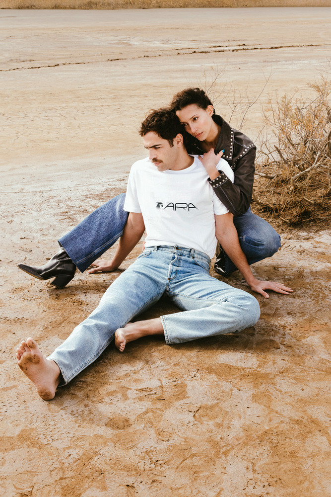
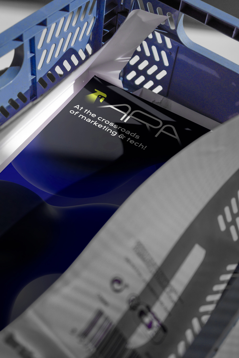
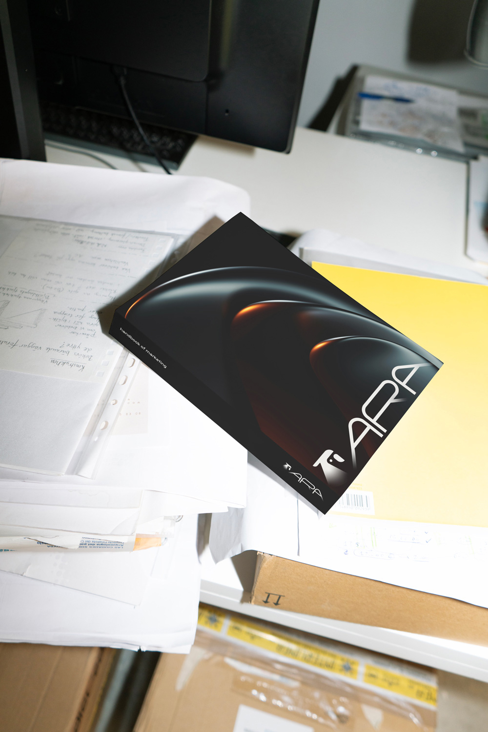
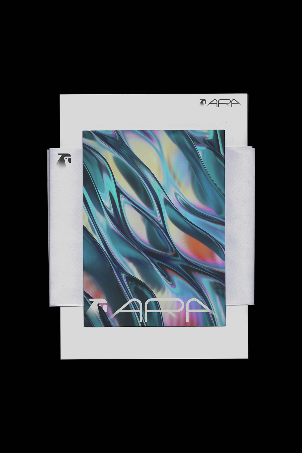
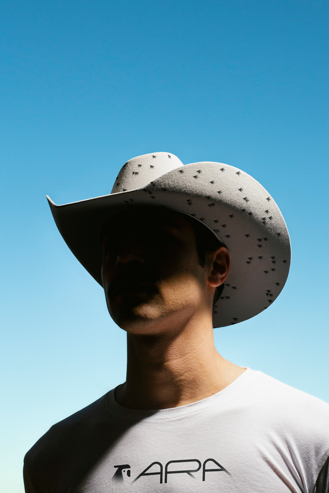
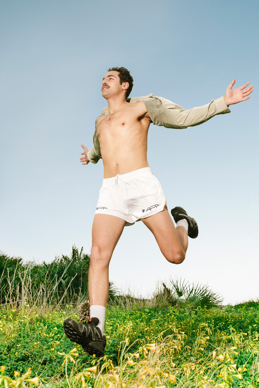
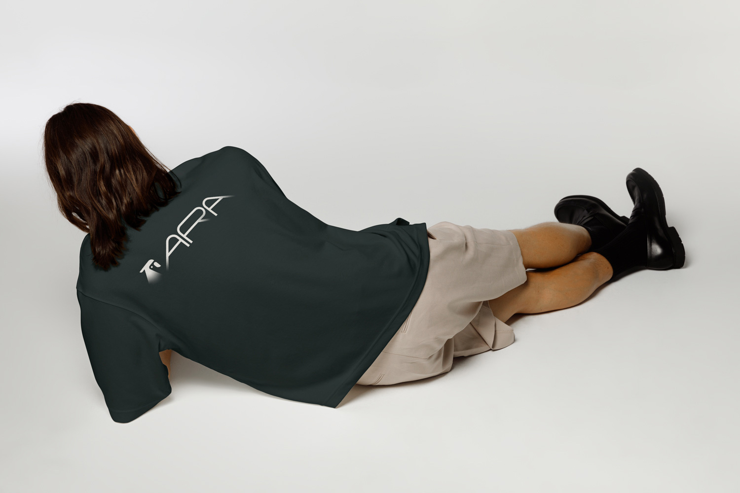
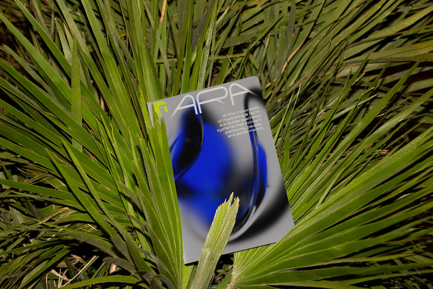
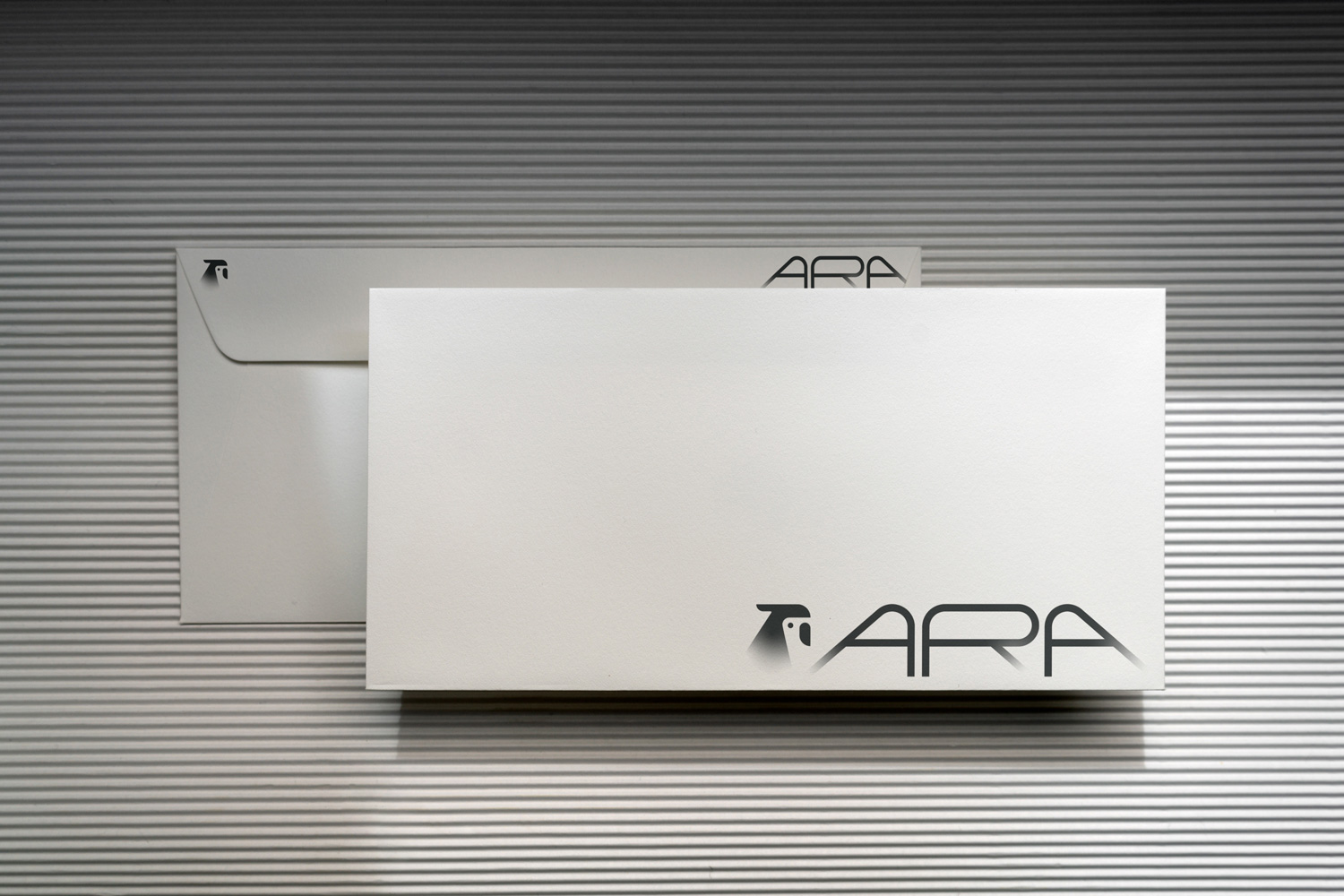
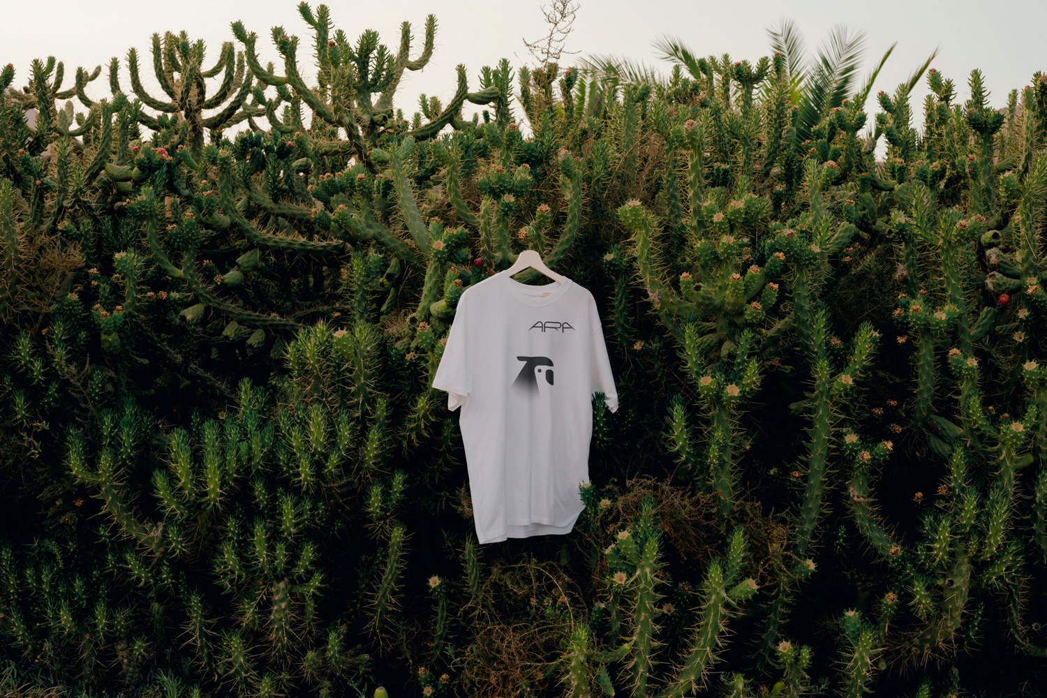
Case Study. Ara is a technology-focused marketing agency that combines marketing automation, CRM integration and digital development. With a global perspective and cultural expertise in Latin America and Europe, Ara works in agile, interdisciplinary teams and combines creativity with technology. The focus is on co-creation, data-driven growth and scalable, system-based solutions for international B2B brands.
My tasks:
Preparation & project launch
Research & analysis
Brand strategy
Visual strategy
Logo development
Corporate design system
Brand assets & applications
Brand guidelines


Client project. BoEnergie is a sustainable energy consultancy based in the Ruhr region. I developed a complete brand identity for the company, as well as a UX/UI concept that reflects its honest and forward-looking mission.
The brand identity features a modern, clean design that conveys professionalism and innovative strength. Minimalist elements and a harmonious colour palette emphasise the focus on sustainable, forward-looking energy solutions and a responsible attitude towards the environment and technology.
My tasks:
Preparation & project launch
Research & analysis
Brand strategy
Visual strategy
Logo development
Corporate design system
Brand assets & applications
Brand guidelines


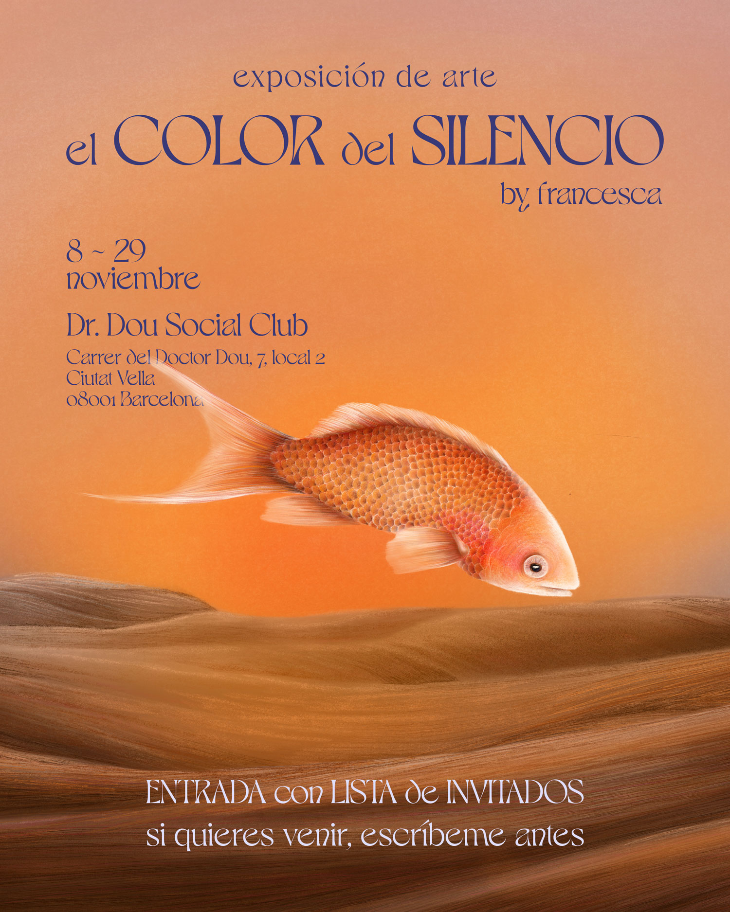
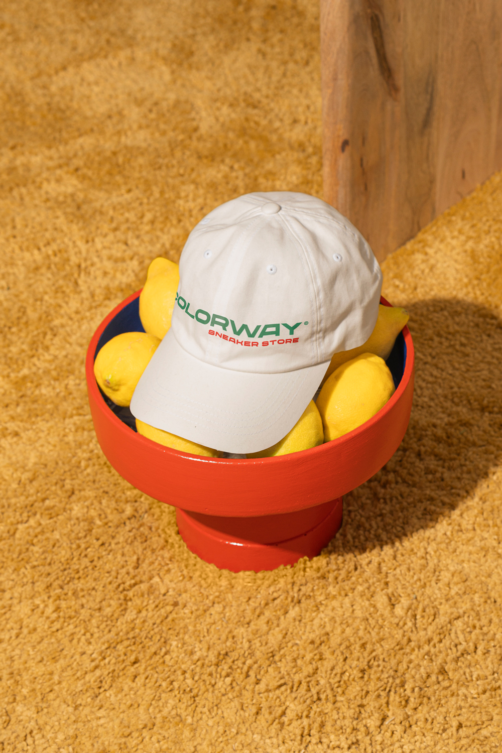
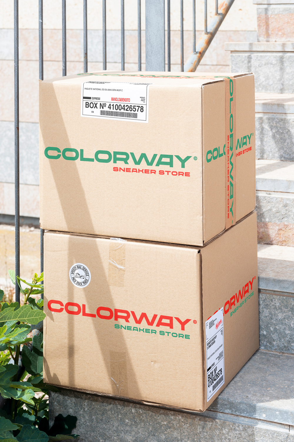
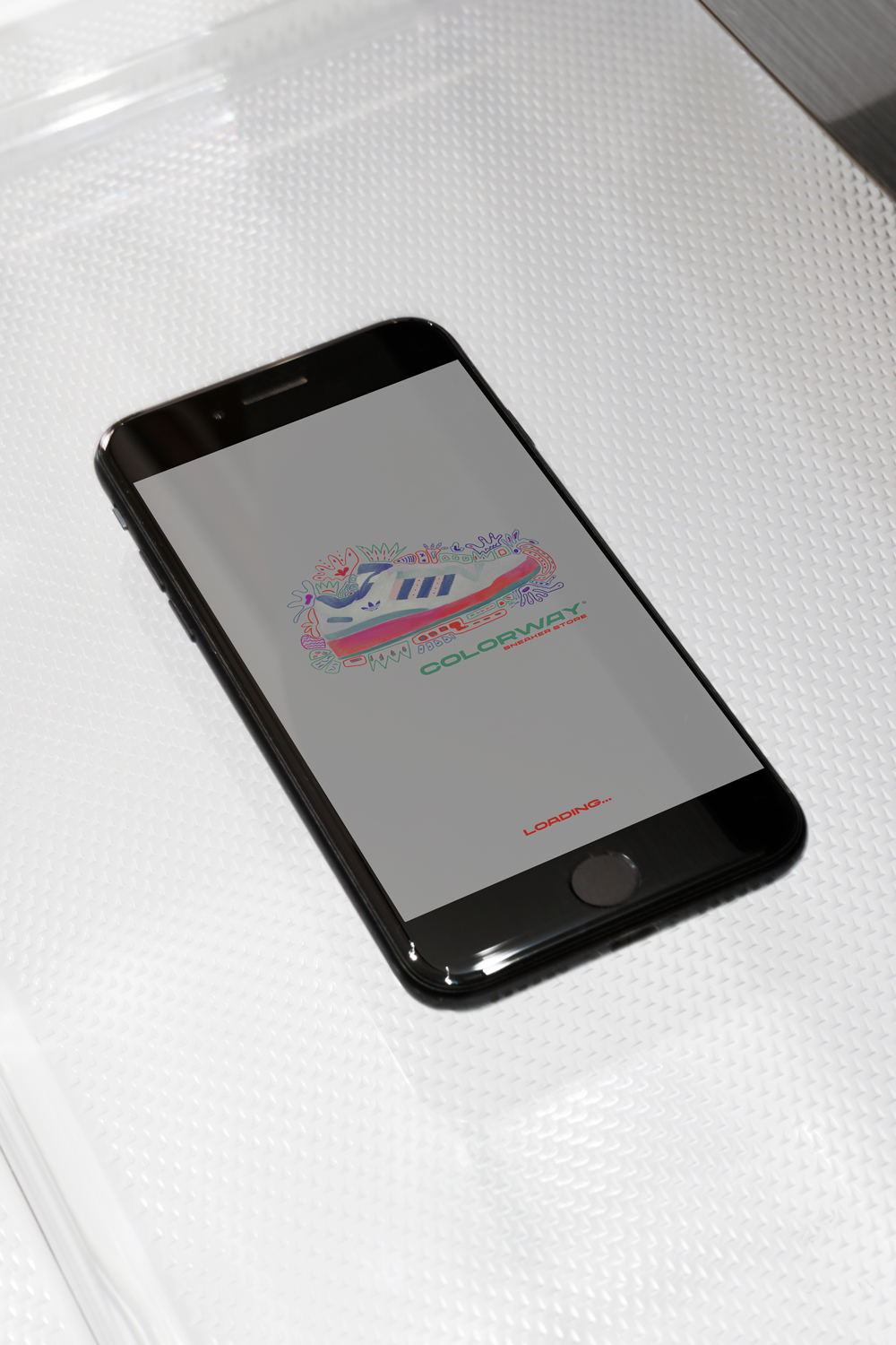
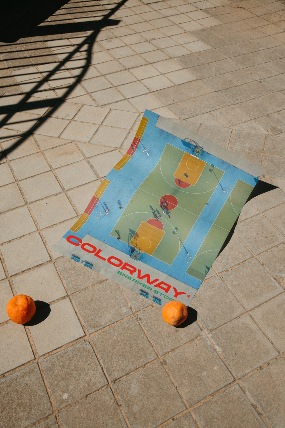
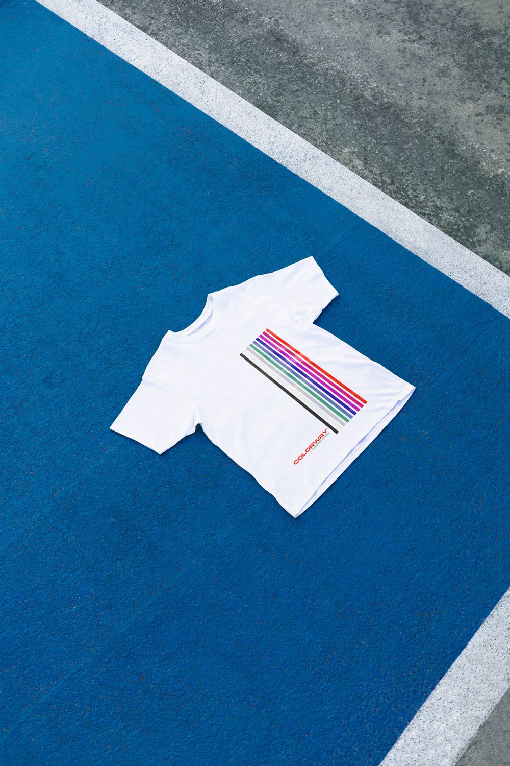
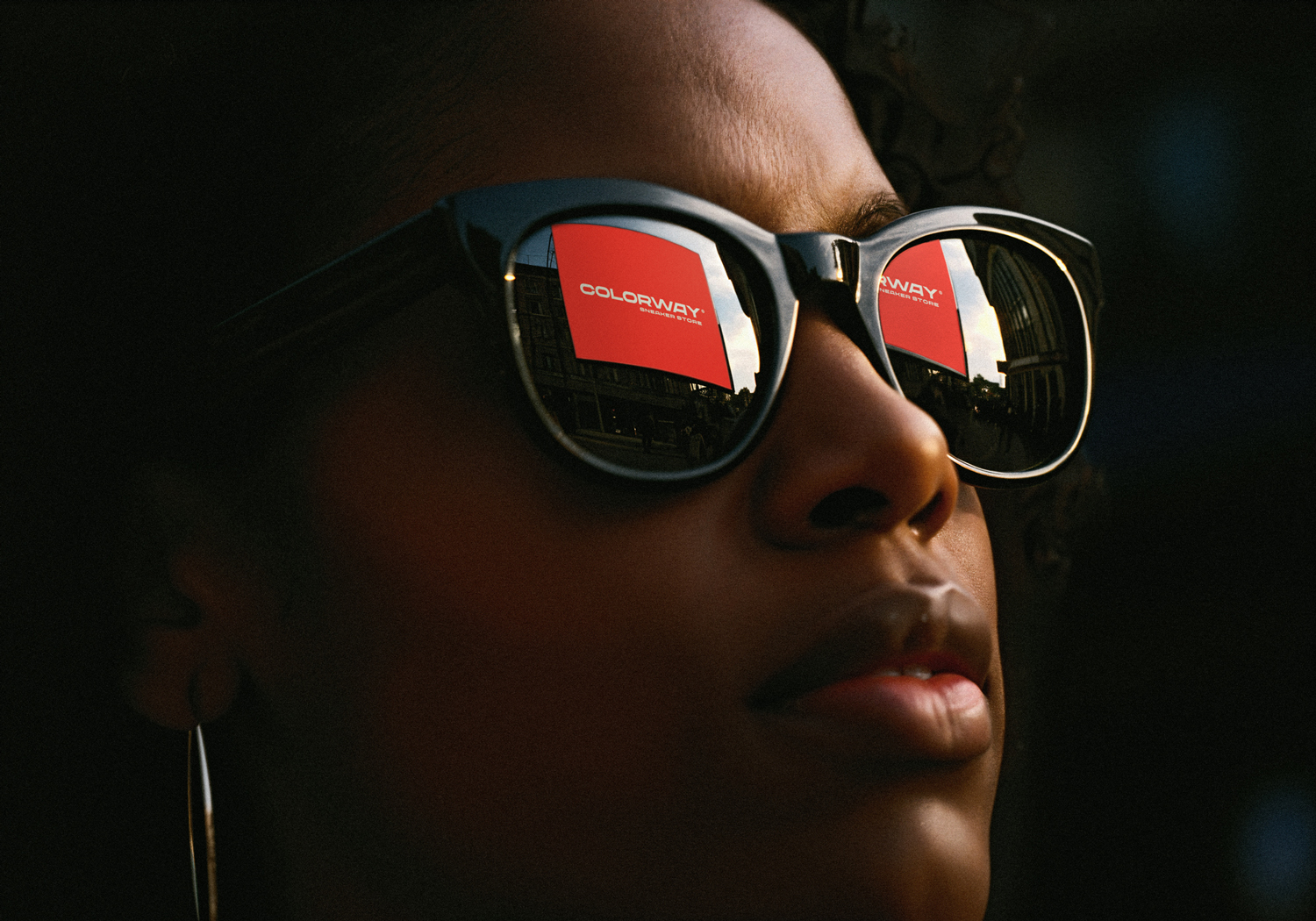
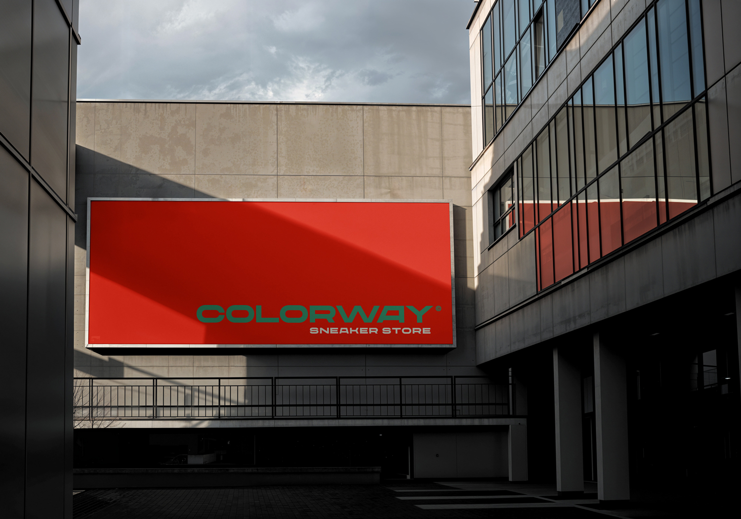
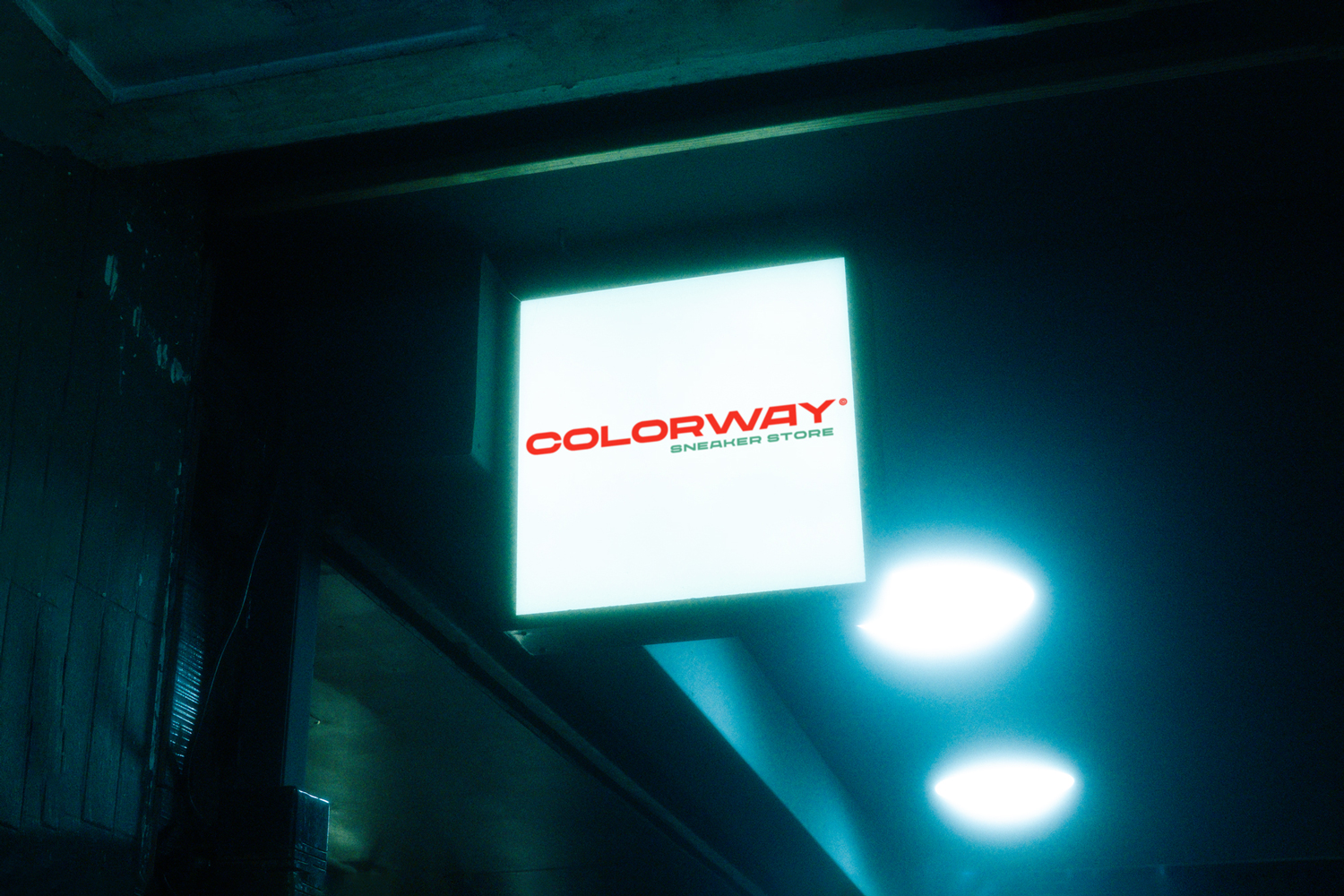
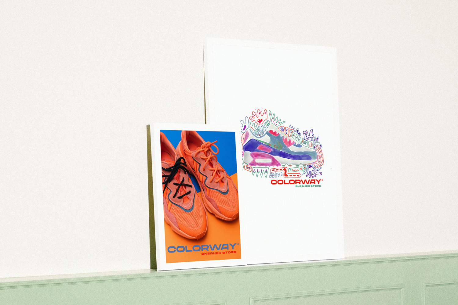
Case Study. Colorway was born in the heart of Barcelona’s Raval neighbourhood – a raw, vibrant and multicultural district brimming with street style, skate culture, migration and underground creativity. Here, stories are painted on walls, identities are in flux and style becomes a language.
Colorway is not just a sneaker app, but a platform for cultural storytelling, connection and authentic style.
The project is purely fictional and serves to demonstrate my UI/UX skills. All brands, logos and product images belong to their respective owners and are used for illustrative purposes only.
My tasks:
Preparation & project launch
Research & analysis
Brand strategy
Visual strategy
Logo development
Corporate design system
Brand assets & applications
Brand guidelines


Client project. Restored Nutrition is a nutrition consultancy in Paris for which a modern, user-friendly platform was designed. The project is currently still in the user testing phase and has not yet been officially launched. The aim was to create a clear visual identity that conveys trust and competence while keeping the user experience intuitive. The design combines appealing typography, harmonious colour palettes and consistent imagery to effectively communicate Restored Nutrition’s mission.
My tasks:
Preparation & project launch
Research & analysis
Brand strategy
Visual strategy
Logo development
Corporate design system
Brand assets & applications
Brand guidelines
Handover & launch


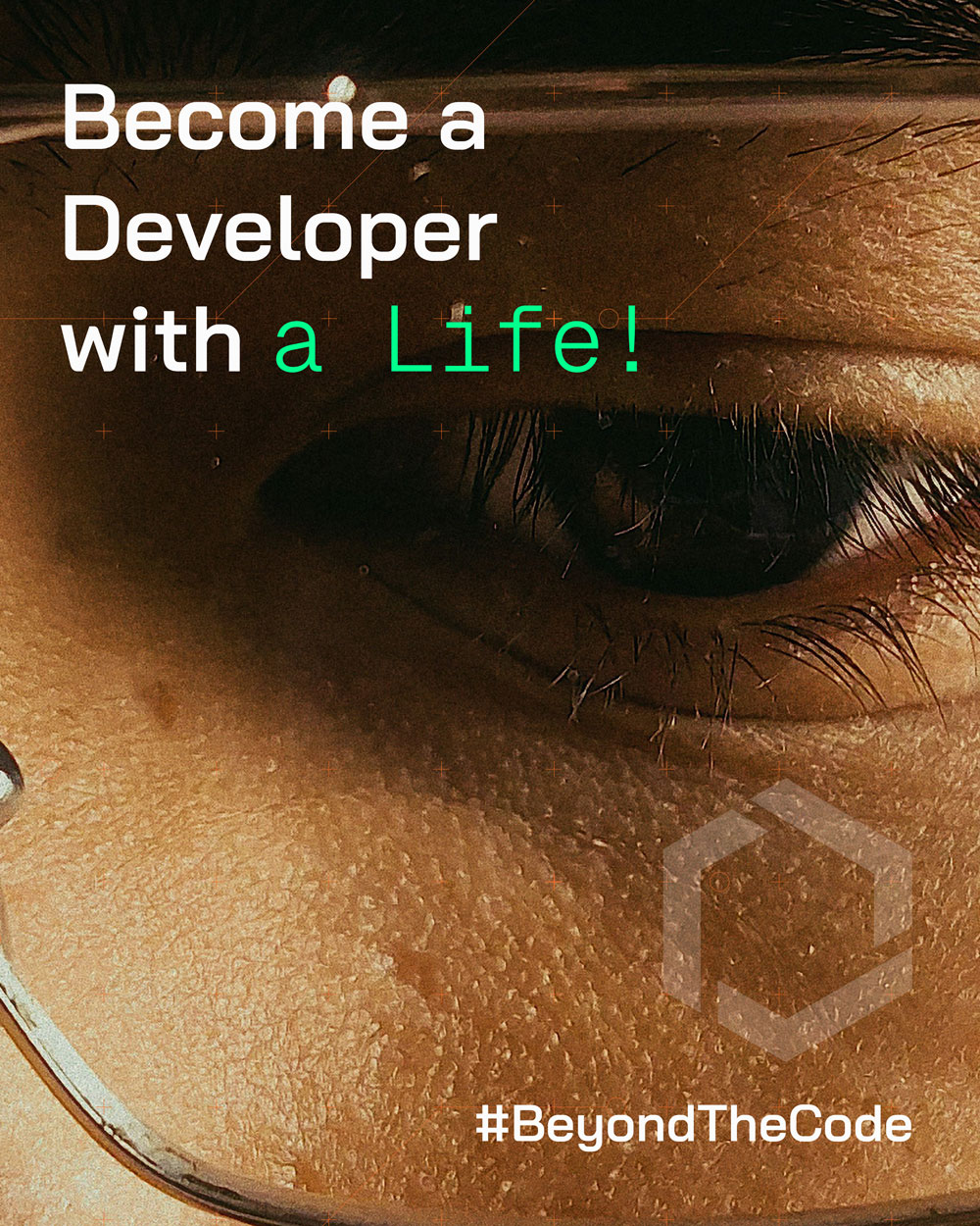
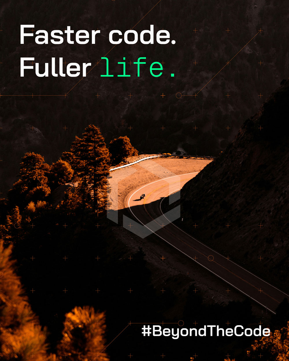
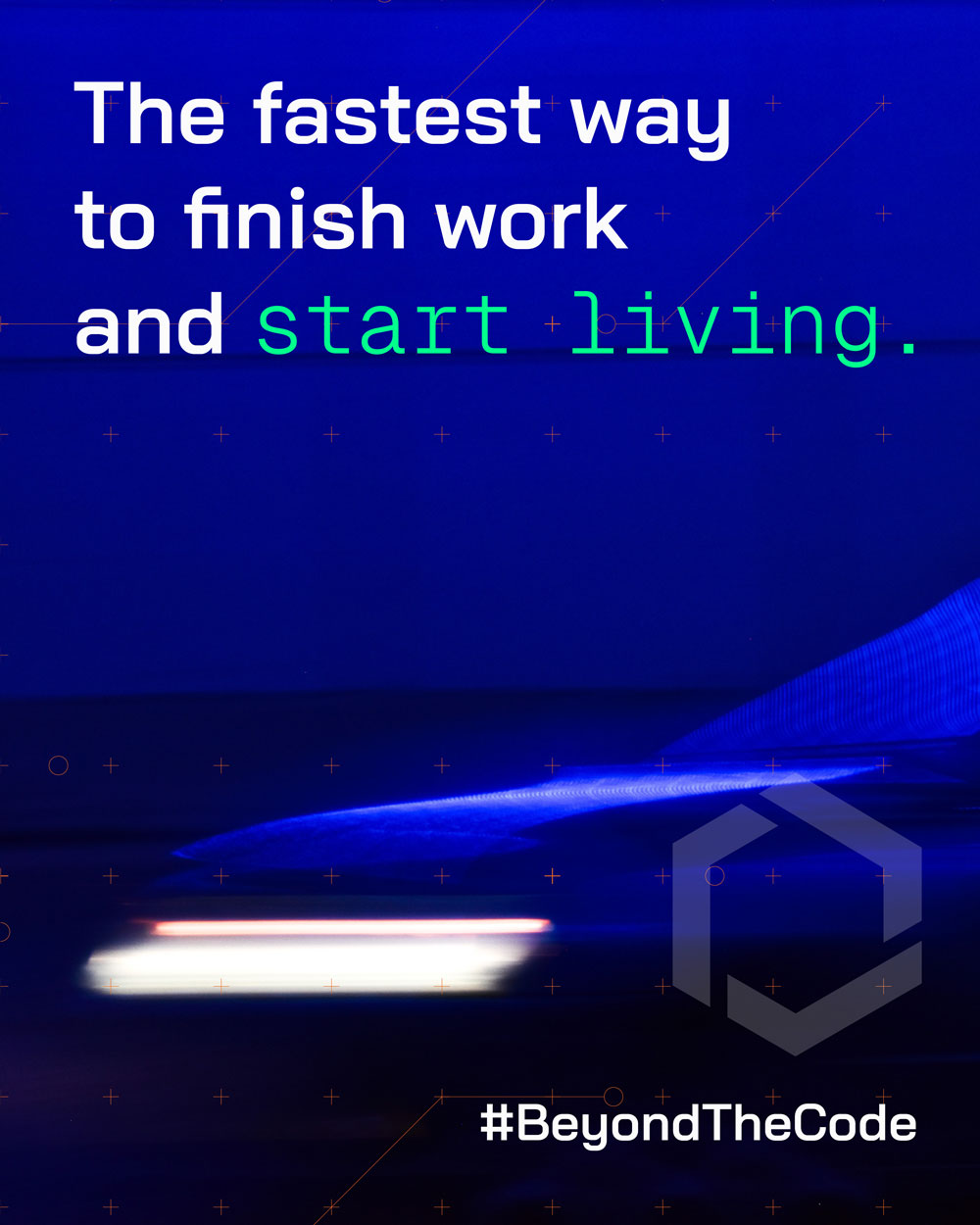
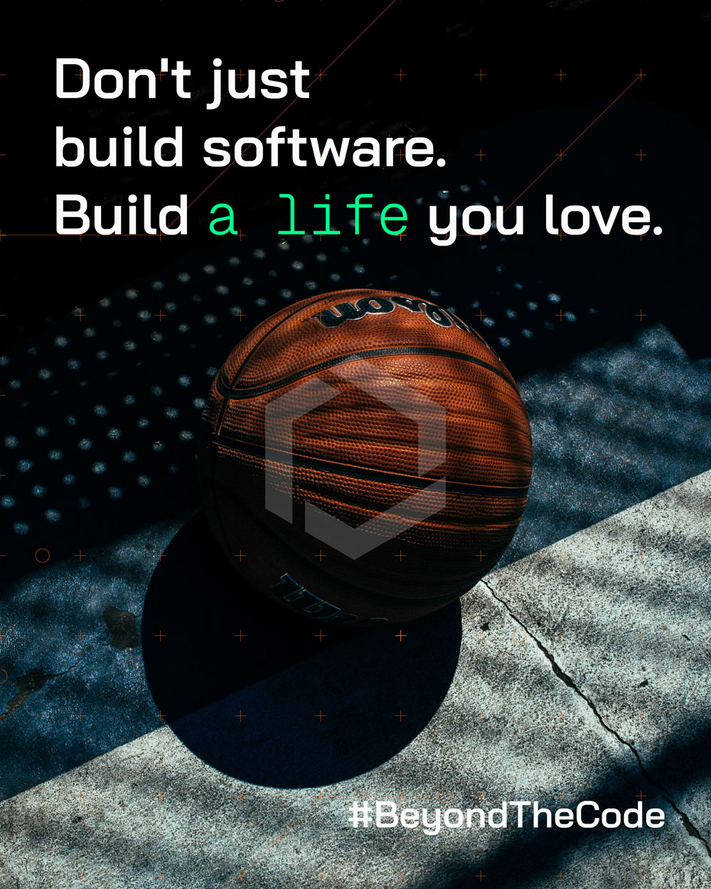
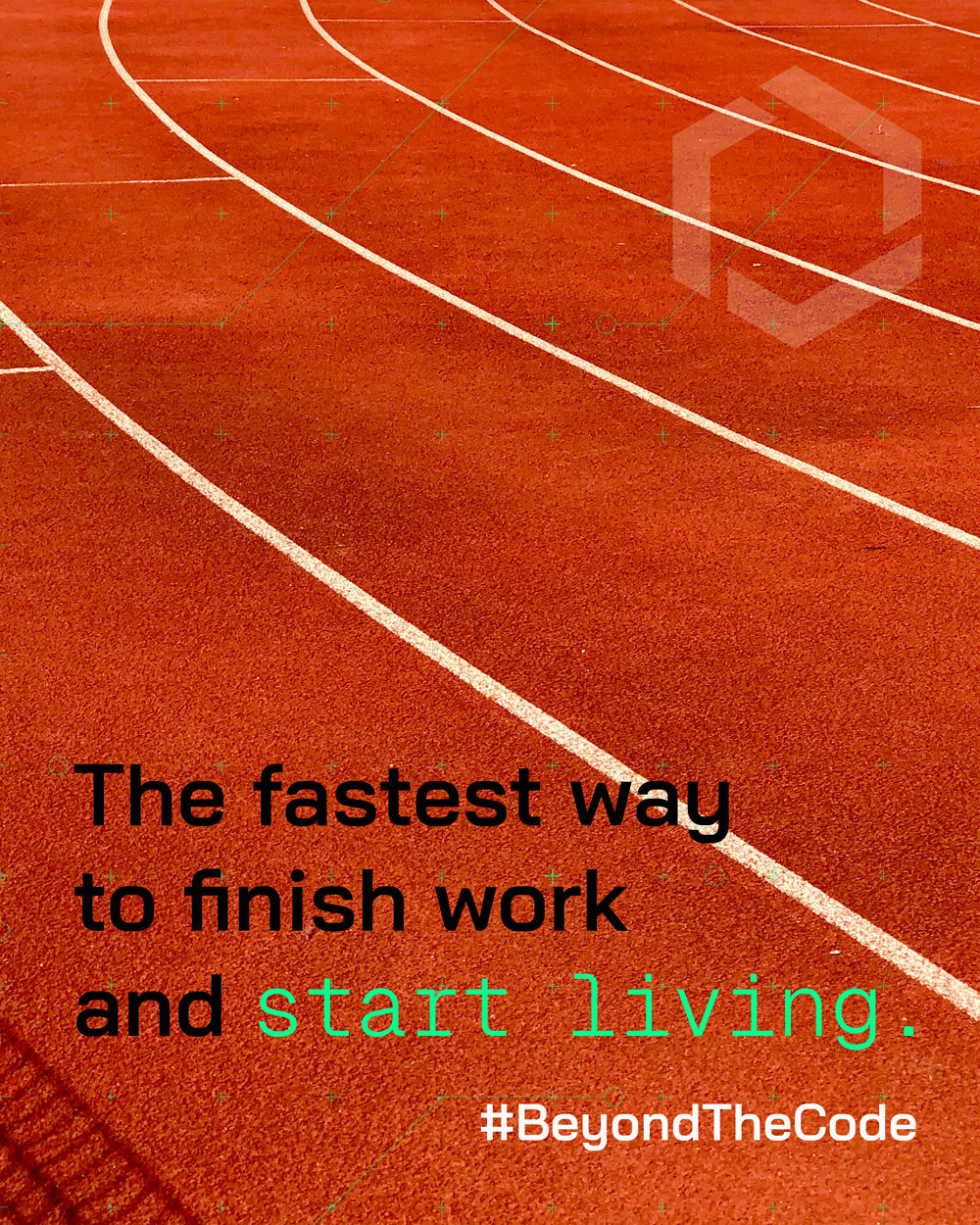
Objective: To transform Blackbox AI from a purely functional developer tool into a lifestyle brand that resonates with the 18–34 developer demographic.
The campaign pivots from Technical Efficiency (how it works) to Emotional Benefit (how it changes your life). By automating the „boring“ parts of coding, Blackbox AI isn’t just selling software—it’s selling time and freedom
- Demographic: Developers aged 18–34.
- Psychographic: Active, social, and ambitious. They value high-performance gear, work-life balance, and „clutch“ moments in both sports and career.
- Key Hobbies: Fitness/Gym, Motorsports, Basketball, Football, and Life Milestones (Relationships/Family).
- Style: High-contrast, „Grit-Look,“ and bold typography.
- Concept: „The Human Code.“ Visuals use a split-screen or overlay technique comparing the sterile world of the IDE (Integrated Development Environment) with the vibrant world of the user’s passions.
- Tone: Bold, provocative, and „Gen-Z“ savvy. It uses street-slang to create an insider feeling for the dev community.
By building an emotional connection through the #BeyondTheCode movement, the company:
- Reduces Churn: Users stay for the brand identity, not just the utility.
- Improves Reputation: Softens the „technical/cold“ image and addresses user complaints by showing a focus on human well-being.
- Differentiates: Creates a clear „cool factor“ that GitHub Copilot or Google Gemini cannot easily replicate.
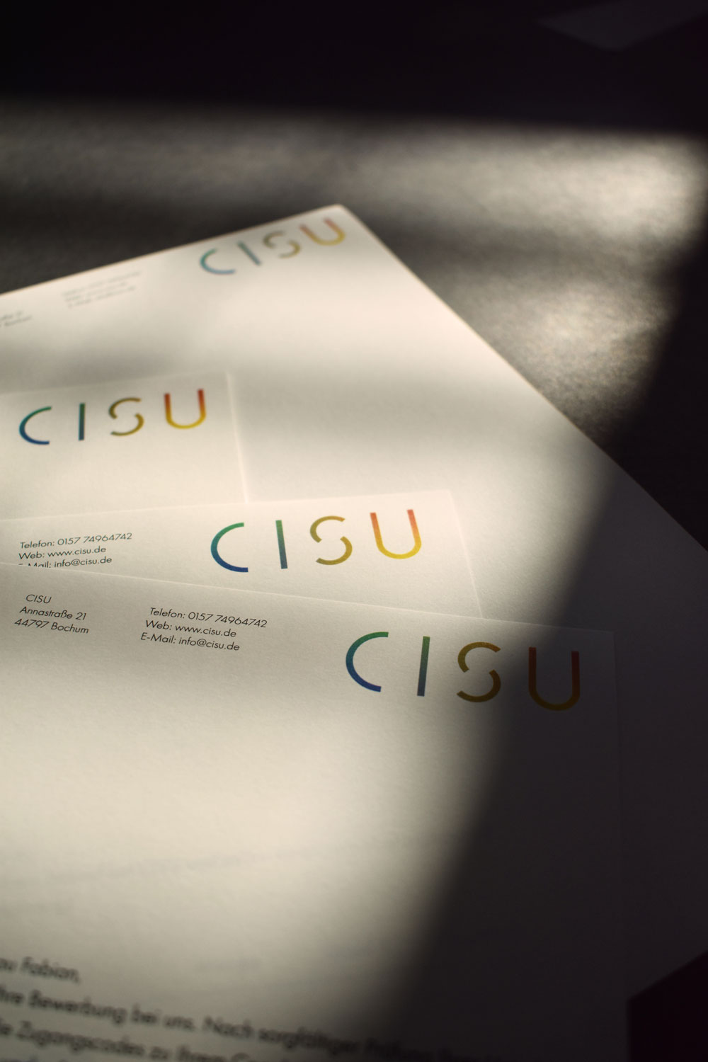
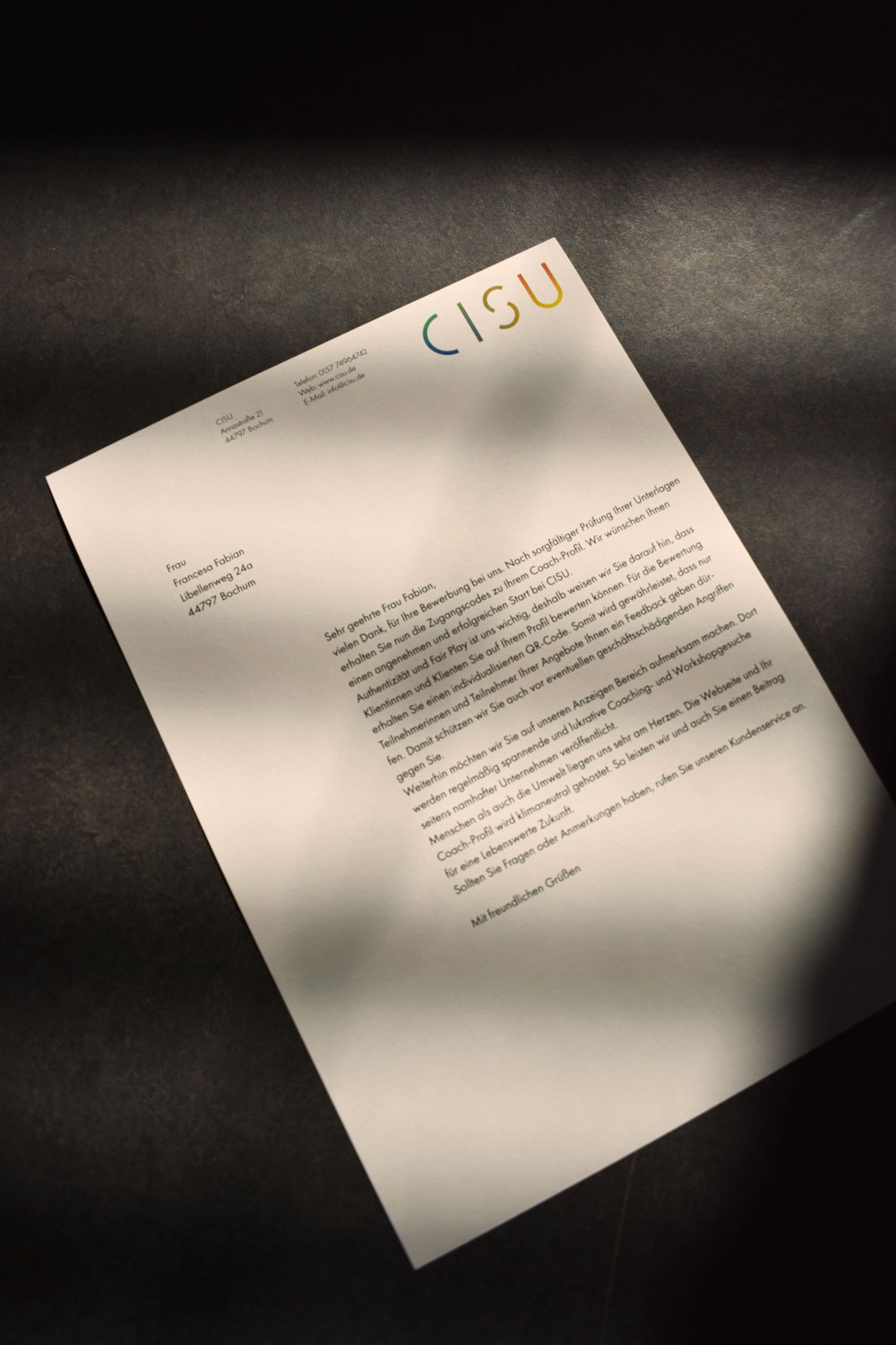
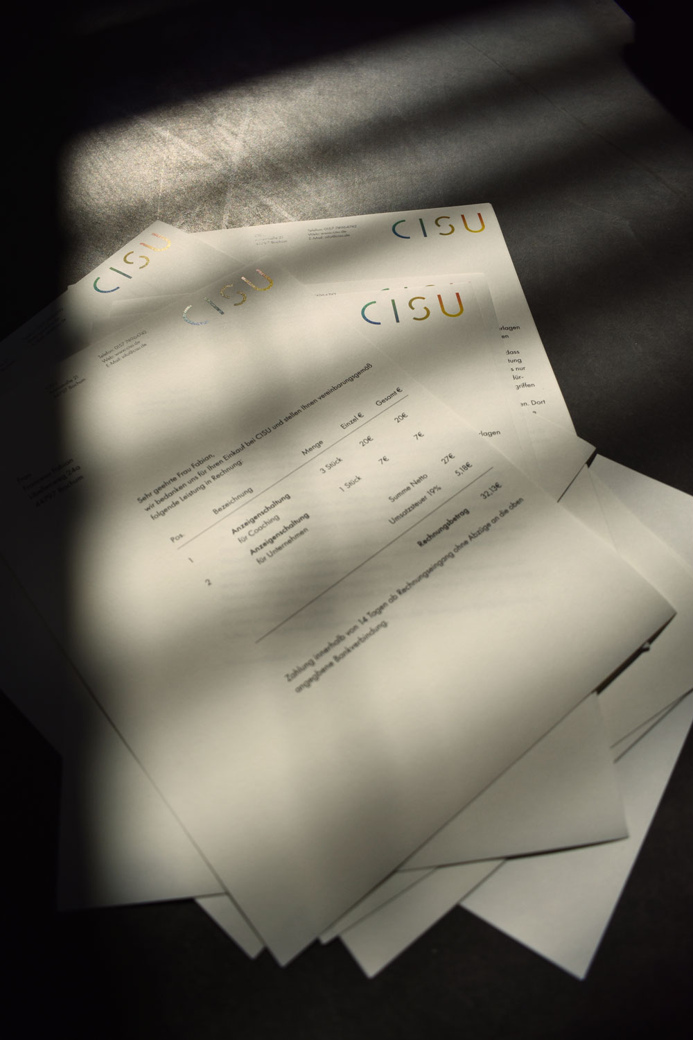
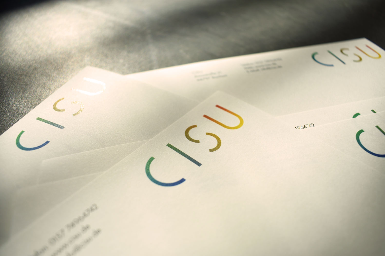
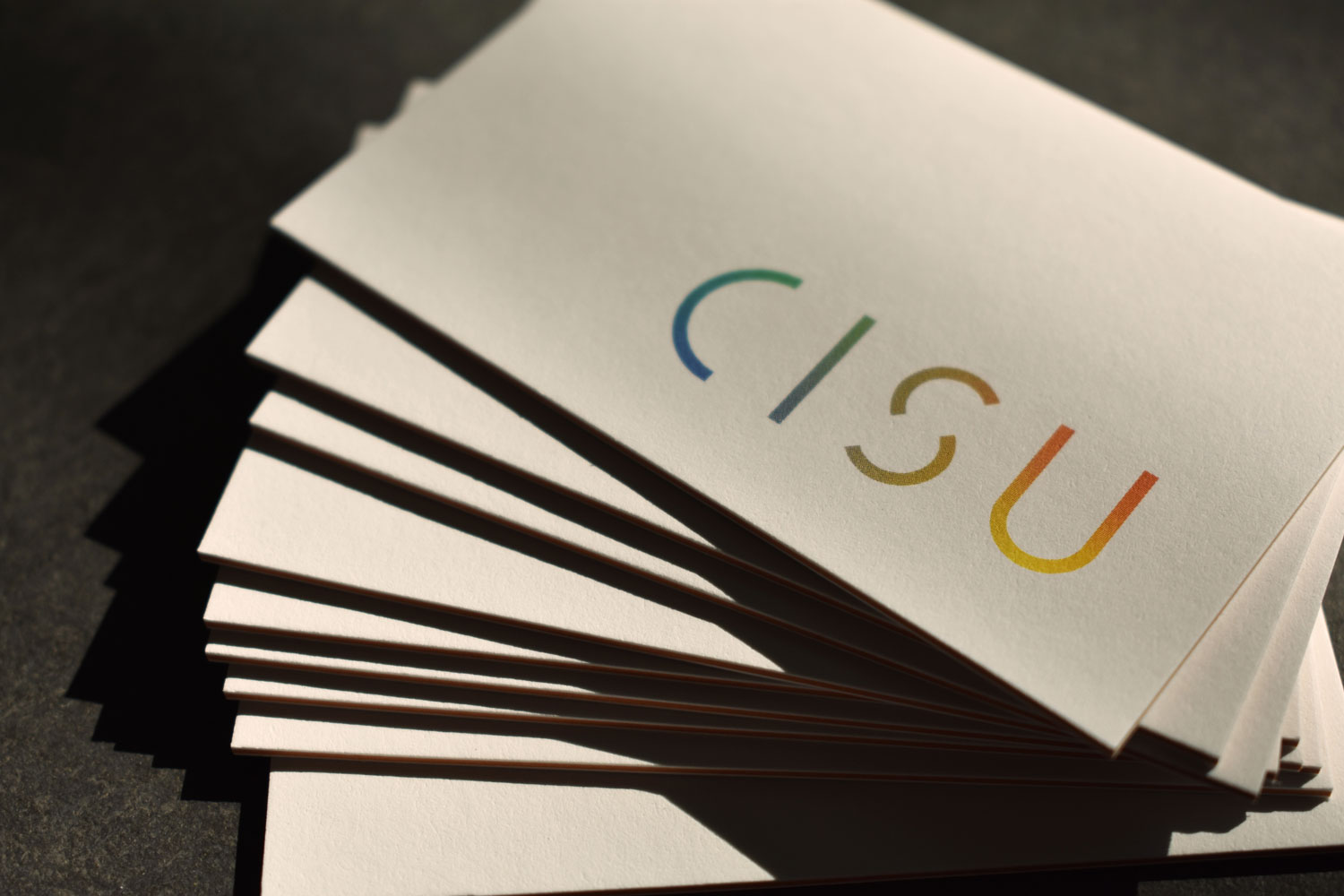
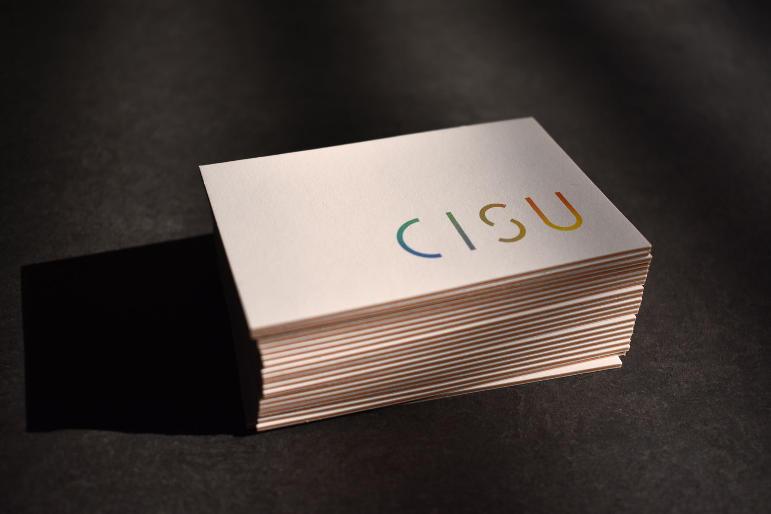
Bachelor’s thesis. As part of my bachelor’s thesis in communication design with a focus on corporate identity, I developed the corporate identity for the start-up CISU, founded by Giulia Fabian in the entrepreneurship workshop at Ruhr University Bochum. CISU offers companies and coaches a platform for consulting and coaching services. I created a timeless, simple design with a warm character and developed an interactive prototype website that puts the consultants in the spotlight. I also designed business documents, letters, invoices and business cards.
My tasks:
Preparation & project launch
Research & analysis
Brand strategy
Visual strategy
Logo development
Corporate design system
Brand assets & applications
Brand guidelines


Client project. I developed an Instagram campaign in Barcelona for the Brazilian jewellery brand DosTres. The design focused on simplicity, warm colours and authentic imagery, with hands emphasising the emotional connection to the jewellery. The jewellery took centre stage, photographed on glass in contrast to soft cat fur, visually combining warmth and strength.
My tasks:
Objectives & Strategy
Content Planning
Production
Editorial Plan & Publication


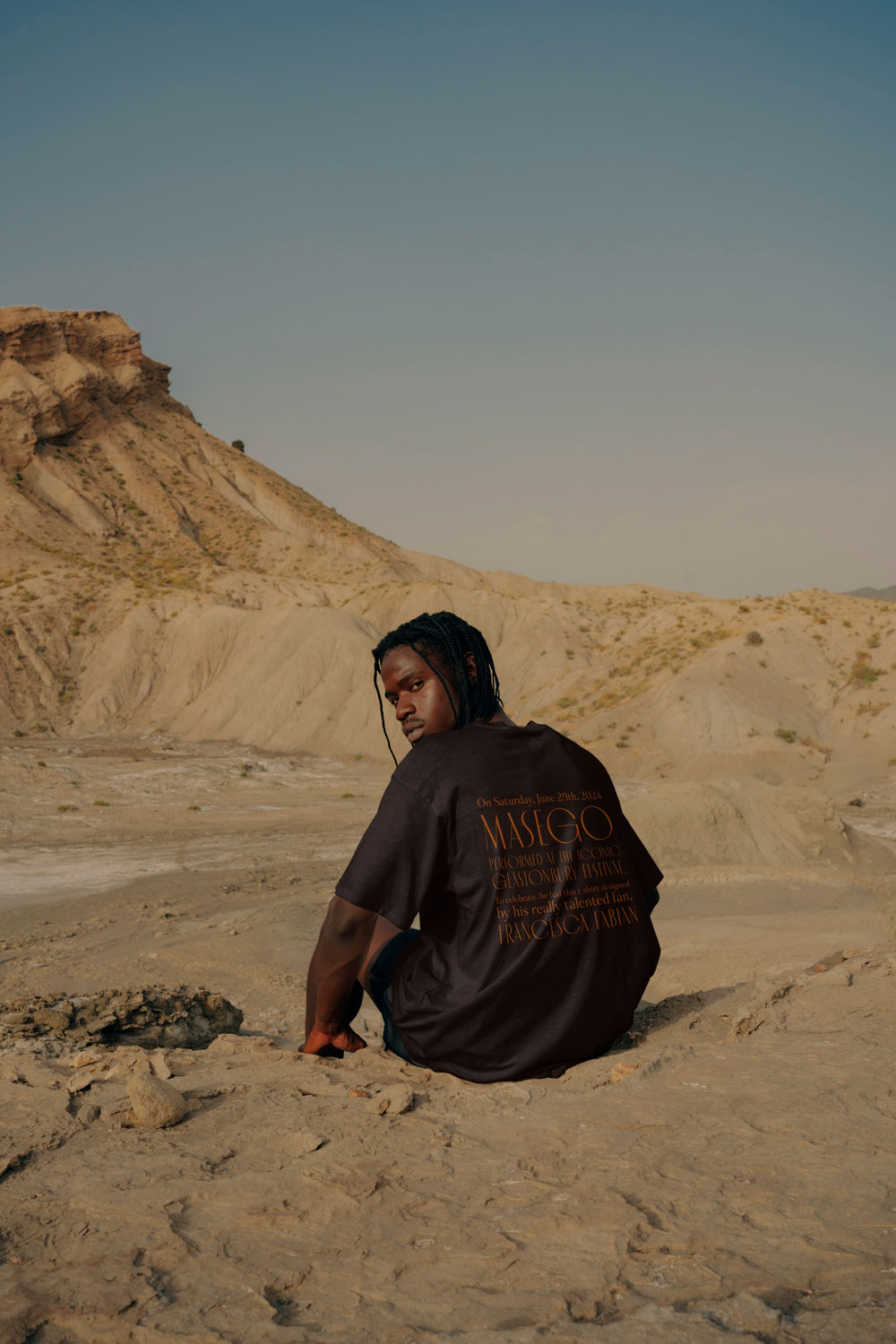
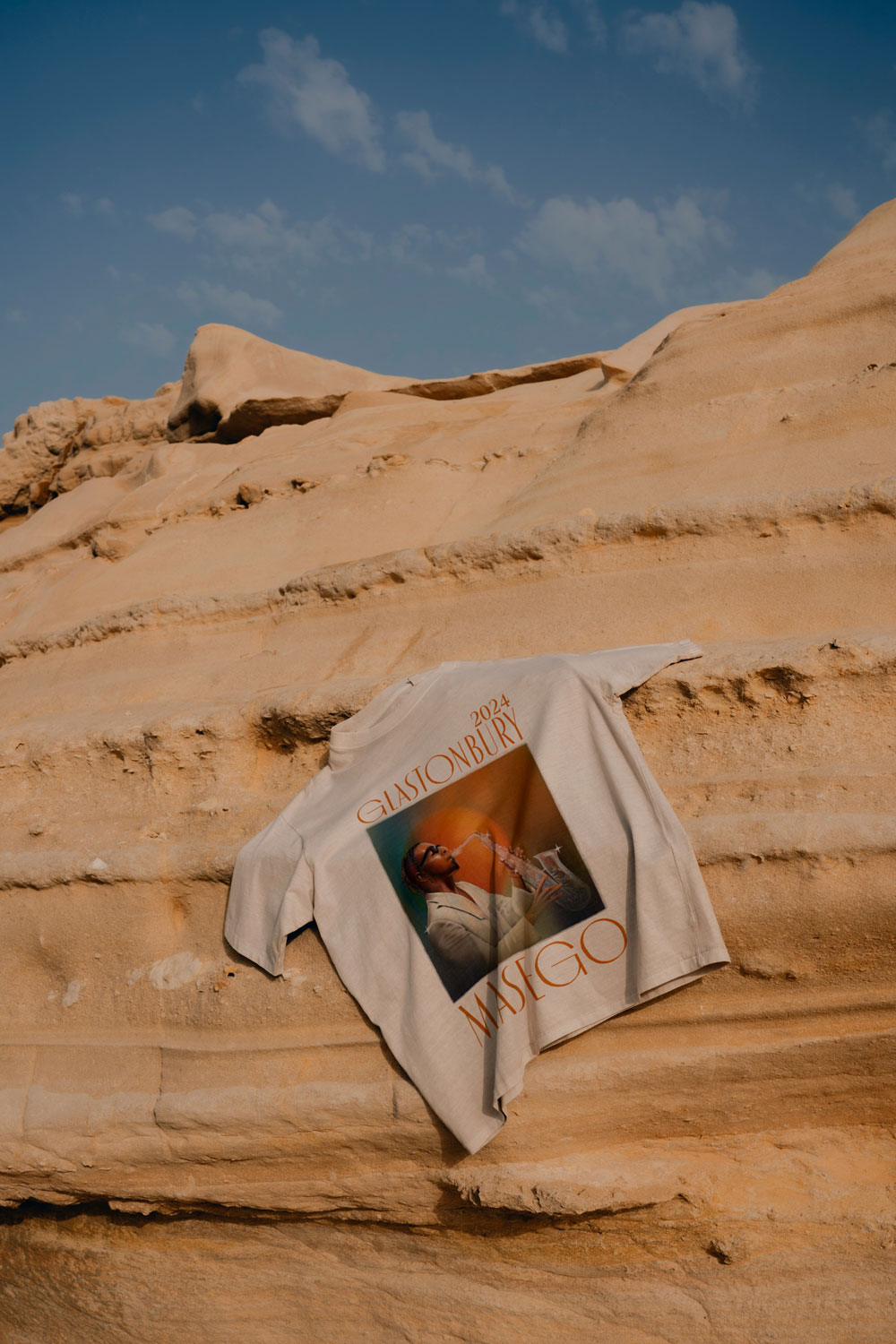
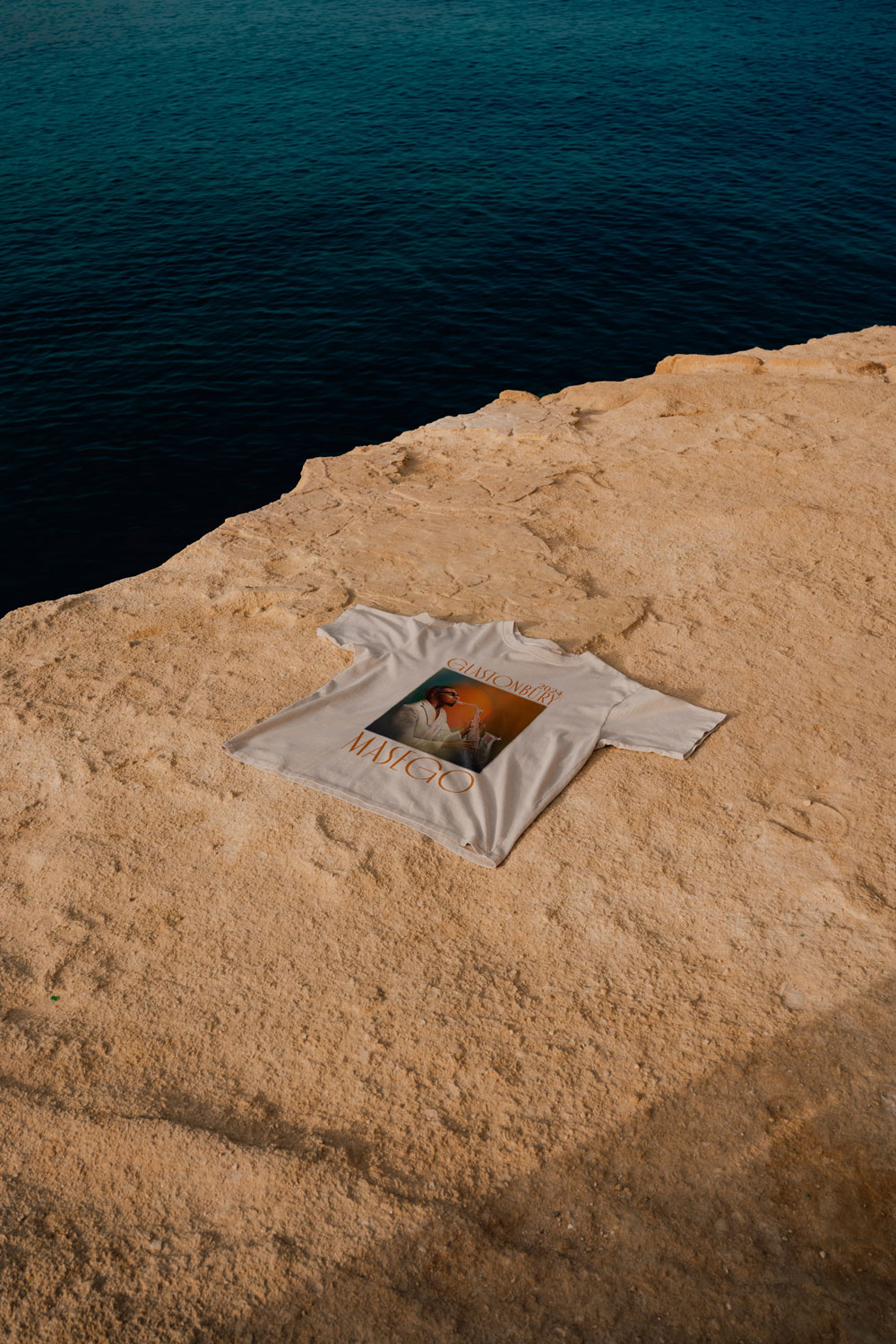
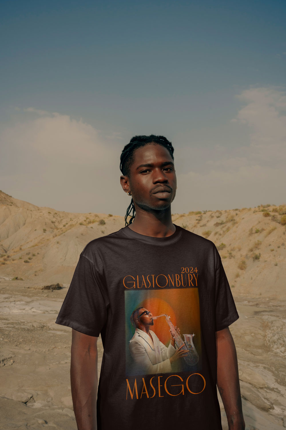
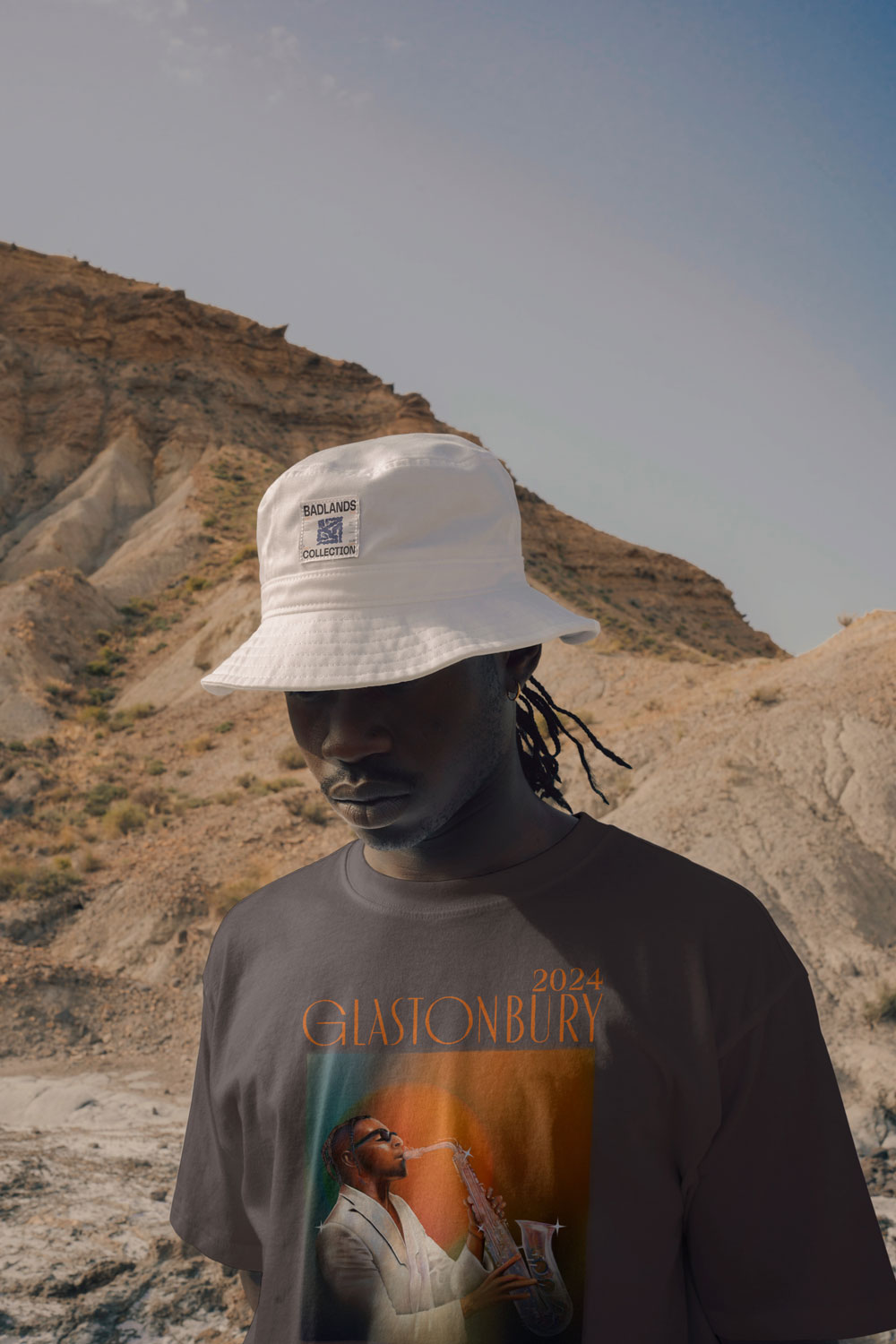
Design competition. My digital artwork took second place in the design competition on Oditi for Masego’s Glastonbury performance, beating over 160 other entries. The design features dark, rich colours and shows Masego in a sparkling white suit, deeply immersed in his music on the saxophone. My artwork reflects the emotional depth and unique sound of his music and captures the elegant, glamorous atmosphere of a jazz club.
My tasks:
Briefing & goal setting
Research & analysis
Idea generation & concept development
Planning & storyboarding
Implementation / production
Presentation / launch

work samples
Development of unique brand concepts from brainstorming to implementation, including the design of visual identities, print and digital materials, and event visuals. Interdisciplinary collaboration ensures consistent, modern brand experiences across all touchpoints.
Client project. For this project, we developed the web design, marketing and visual strategy, and corporate identity.
We implemented the ideas together with our team: Creative direction & design/photos: Beate Steil, Texts: Clara Neunzig, Web: Jannes Becherer, Assistant: Francesca Fabian. Our goal was to create a coherent, visually appealing and strategically well-thought-out brand presence.
Distribution of tasks:
Creative direction: Beate Steil
Design & photos: Beate Steil
Texts: Clara Neunzig
Web: Jannes Becherer
Assistant: Francesca Fabian


work samples
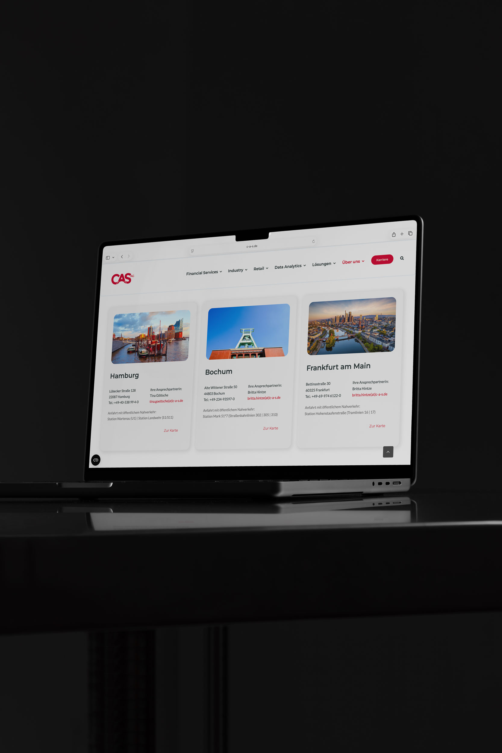
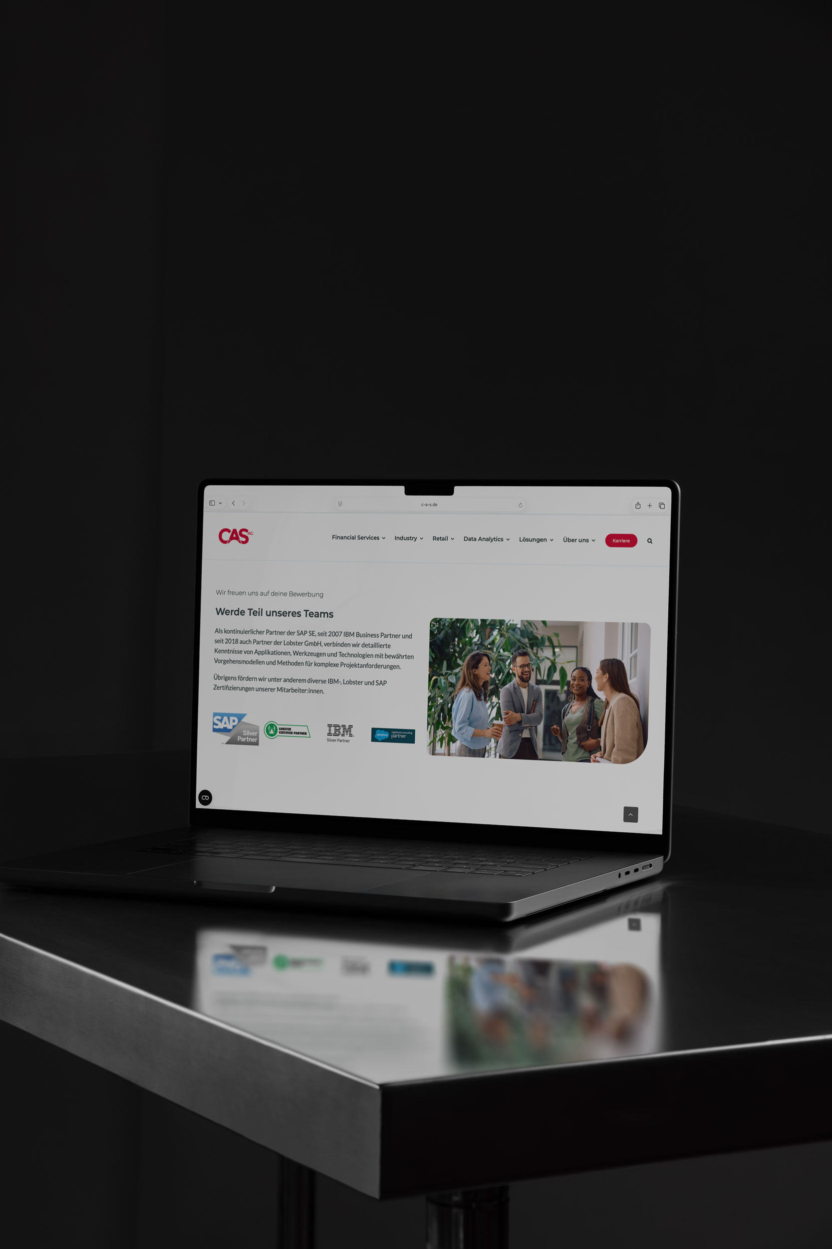
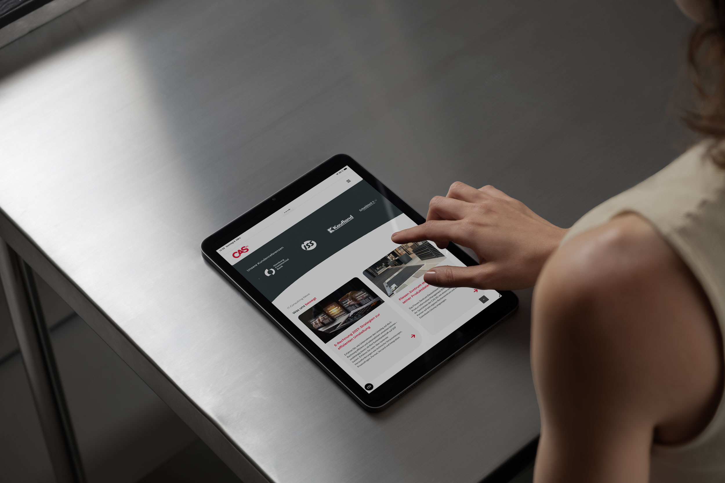
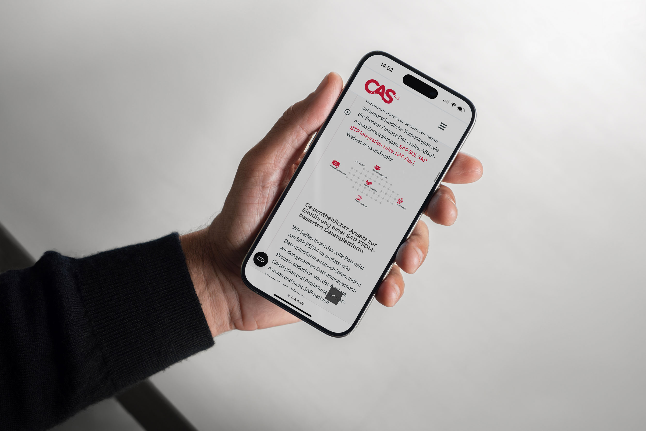
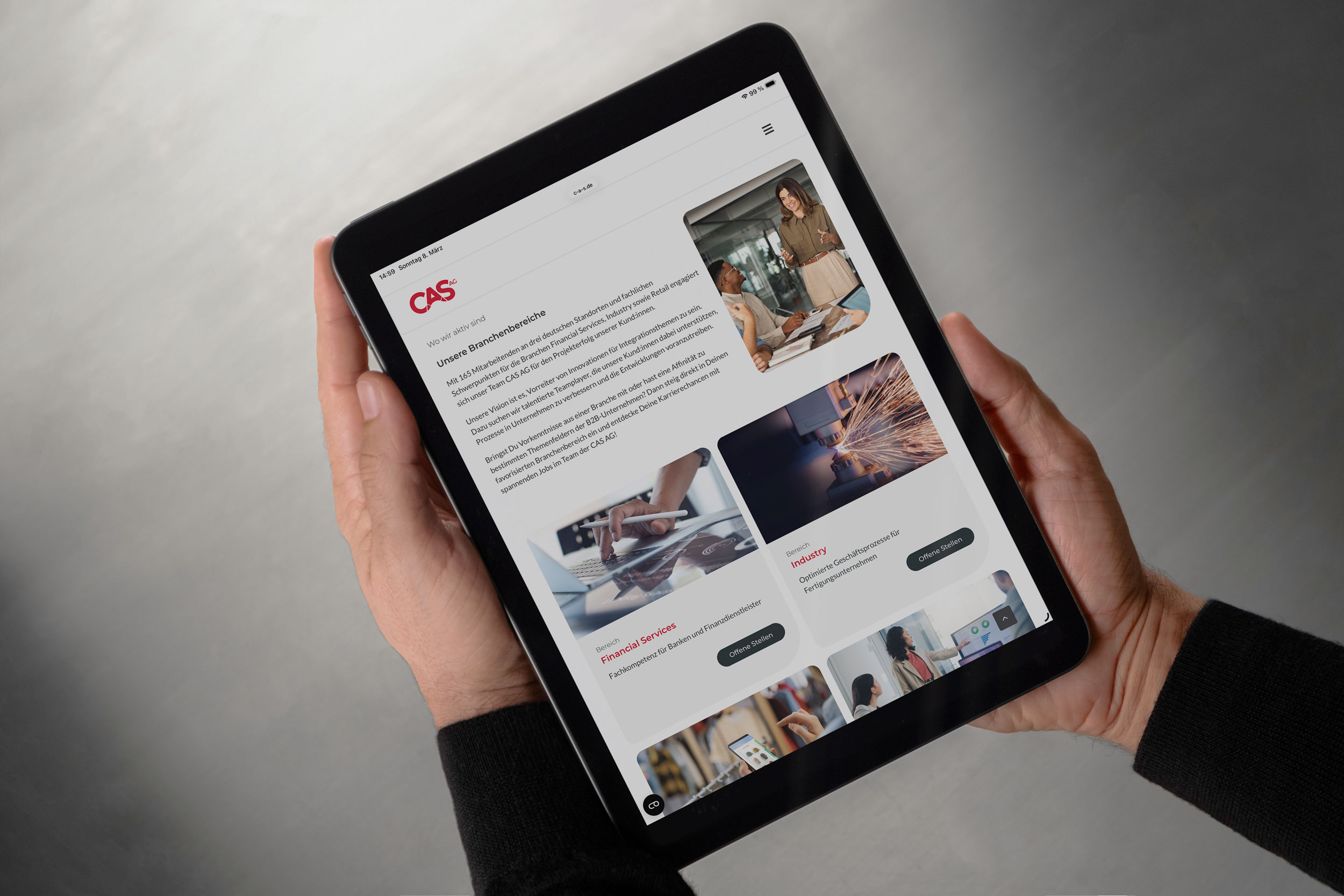
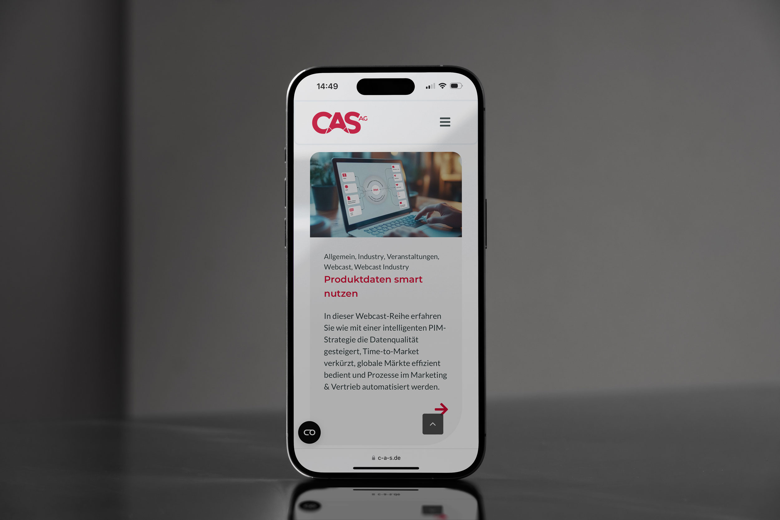
Management of all design activities (UX/UI, branding, visuals, web) for a B2B IT consultancy, including website development, digital assets, trade fair stands, merchandise and internal campaigns. Further development of visual brand elements, conception and implementation of digital campaigns, workshops on brand identity, and creation of animations and motion graphics for consistent brand communication across all channels.
Improving Conversion Rates, Navigation, and Brand Perception


Background
The website was expected to reflect the innovative nature and expertise of the company. However, the existing version did not successfully communicate this.
CAS AG is both an IT consulting and software development company, providing solutions for multiple industries. Yet this diversity and expertise were not clearly presented on the website.
As a result, there was a noticeable gap between the company’s innovative positioning and its digital presence.
The existing website created several business challenges:
- low conversion rates
- limited search engine visibility
- too few contact inquiries
- low engagement with product pages
- limited traffic to career pages
Overall, the website did not effectively support marketing, lead generation, or recruiting goals.
From a user perspective, the website was difficult to navigate and lacked clarity.
Key issues included:
- inconsistent presentation of different industry sectors
- a confusing and poorly structured product portfolio
- missing call-to-actions for inquiries or purchases
- unstructured career pages
- inconsistent design across different pages
- overly generic content without clear differentiation from competitors
- unclear communication of unique selling points
Additionally, product pages were structured inconsistently, making it difficult for users to quickly understand the offerings.


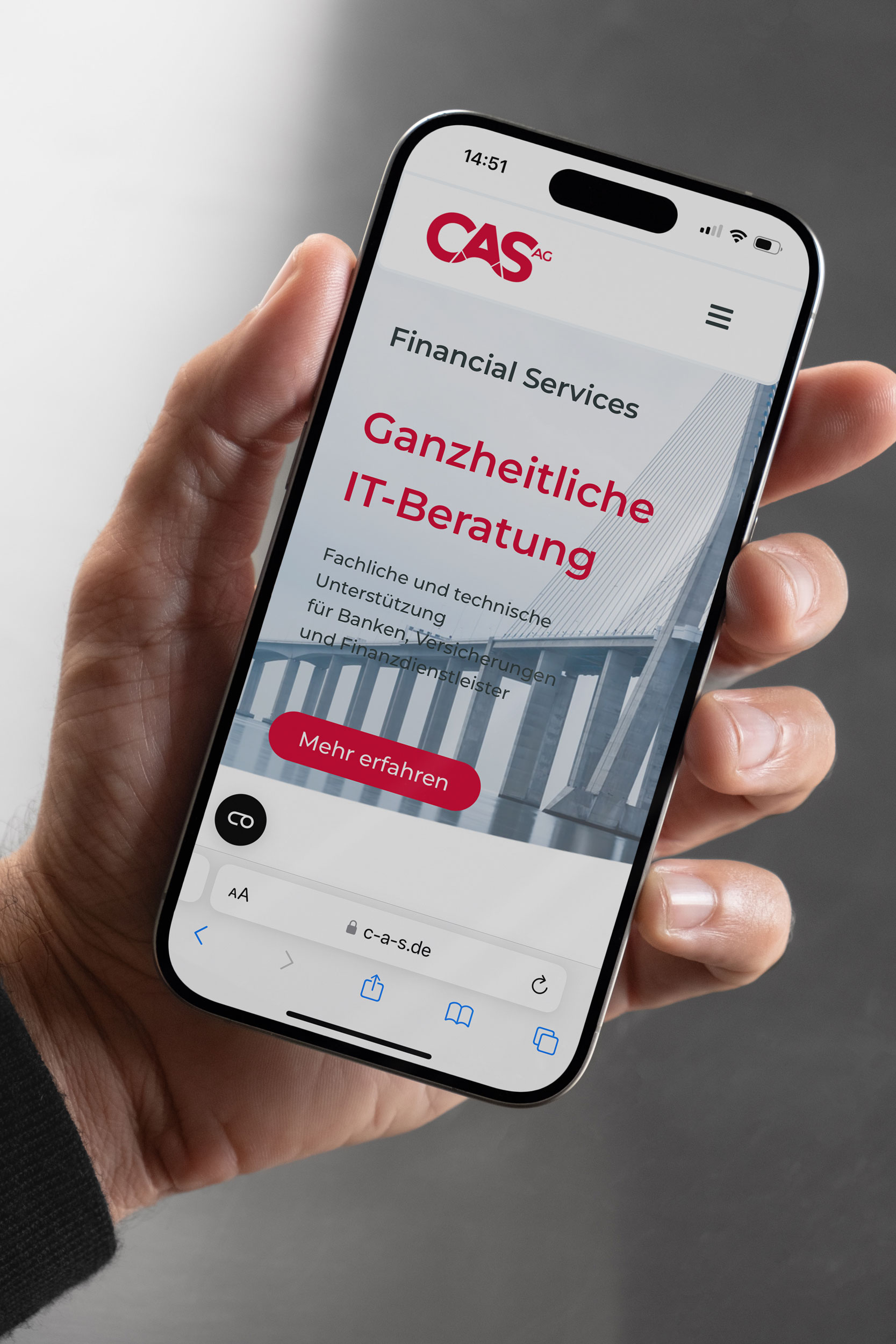
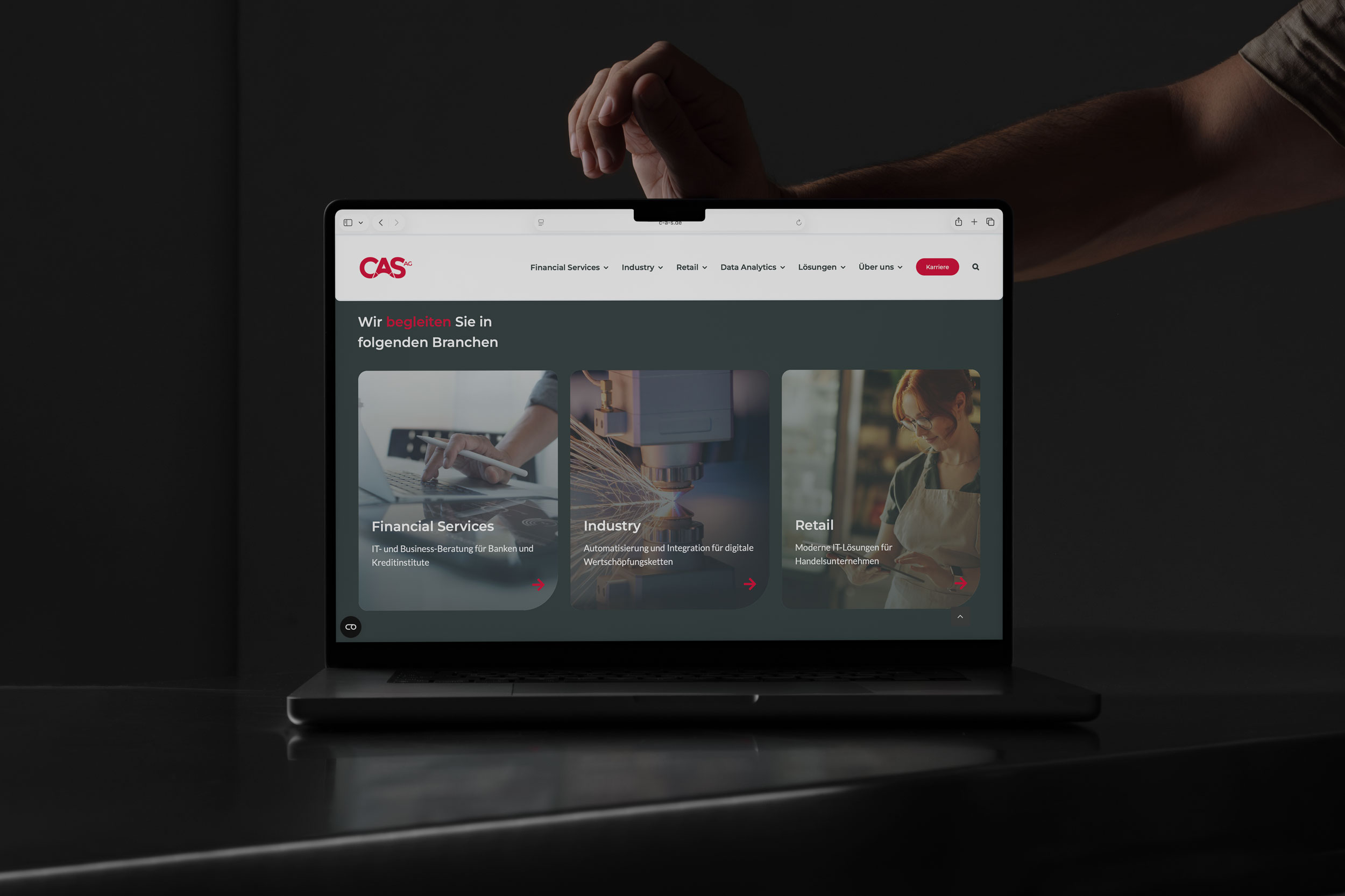
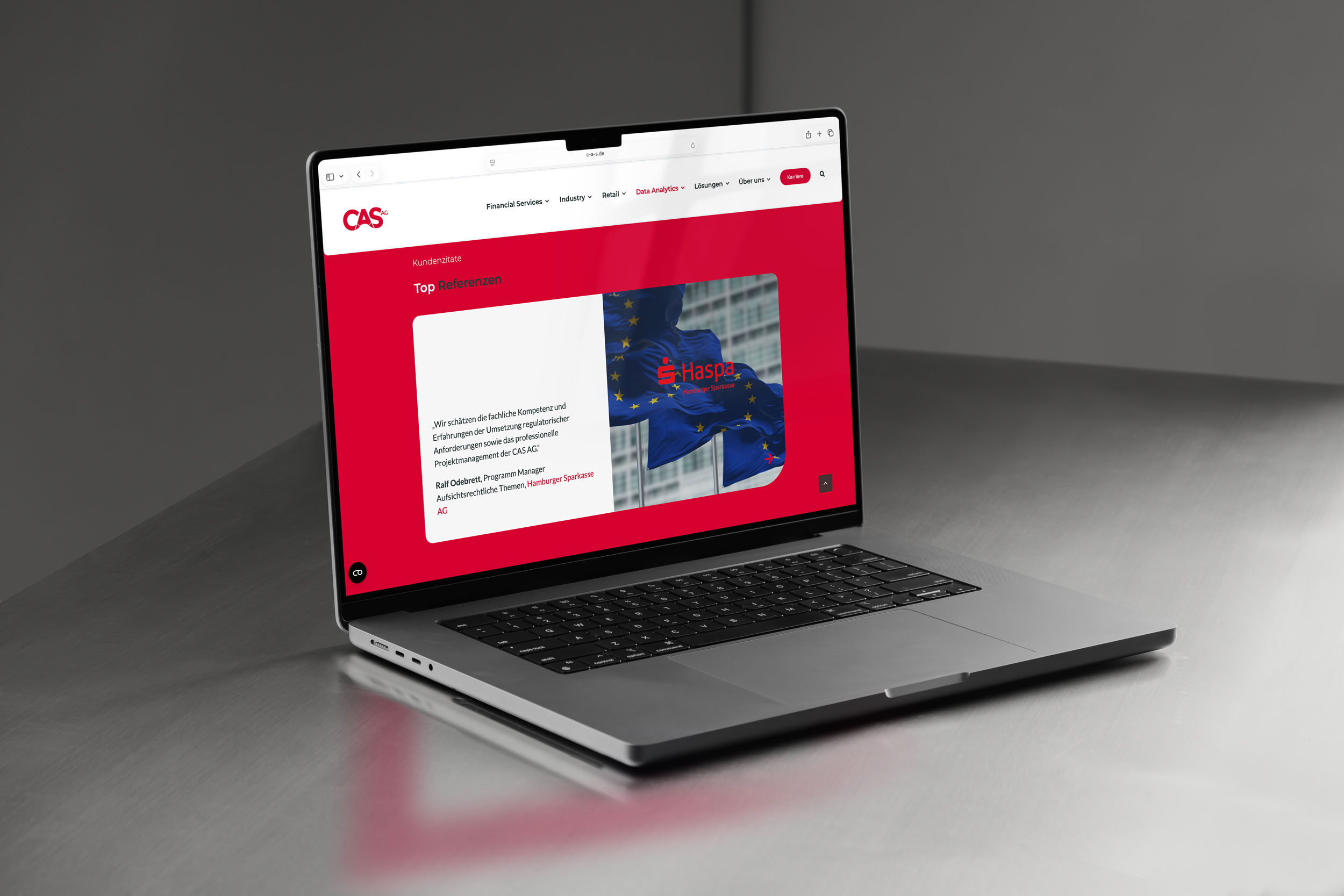
The website redesign significantly improved the digital visibility, usability, and overall performance of the CAS AG website.
Following the redesign and the implementation of an improved content and information architecture, the website achieved a strong and consistent presence in Google search results.
Key results include:
- Average search position: 1.3
- Visibility index increase: +50% in 2024
- Consistent top rankings for relevant industry keywords
The improved page structure, optimized headings, and clearer content hierarchy contributed significantly to this performance.
Organic Traffic Growth
The improved site structure and optimized content strategy led to a strong increase in organic search performance.
2024 results:
- 683,862 organic impressions
- 10,556 organic clicks
These results indicate significantly improved discoverability and increased user engagement with the website.
Technical Performance
Performance optimizations also improved the technical user experience.
Improvements included:
- faster page loading times
- improved page structure
- optimized content hierarchy
These changes contributed to both better search engine rankings and improved usability for users.
Content and Keyword Optimization
As part of the redesign process, the content structure of the website was reworked and optimized.
This included:
- keyword-driven page titles and content structure
- clearer product and service descriptions
- improved readability and scannability
- consistent page layouts across the website
- These improvements helped users understand the portfolio more quickly and navigate the website more efficiently.
work samples
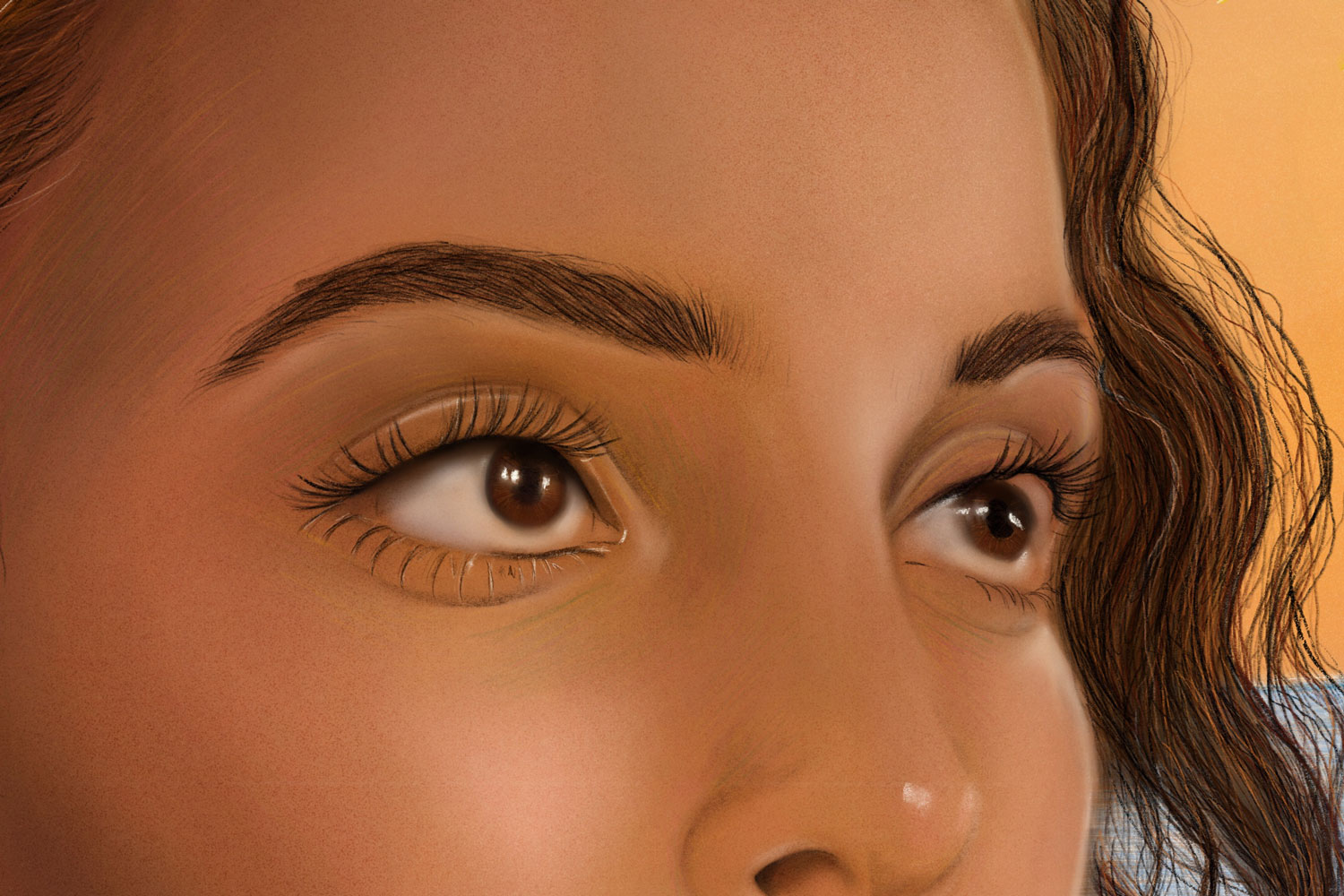
In addition to my design work, I am also active as an artist in the field of digital painting and have had solo exhibitions in Cologne, Barcelona and Bochum. This creative practice helps me to think differently, see differently and design boldly. I also work as a stock photographer for Unsplash, which allows me to further expand my visual diversity.
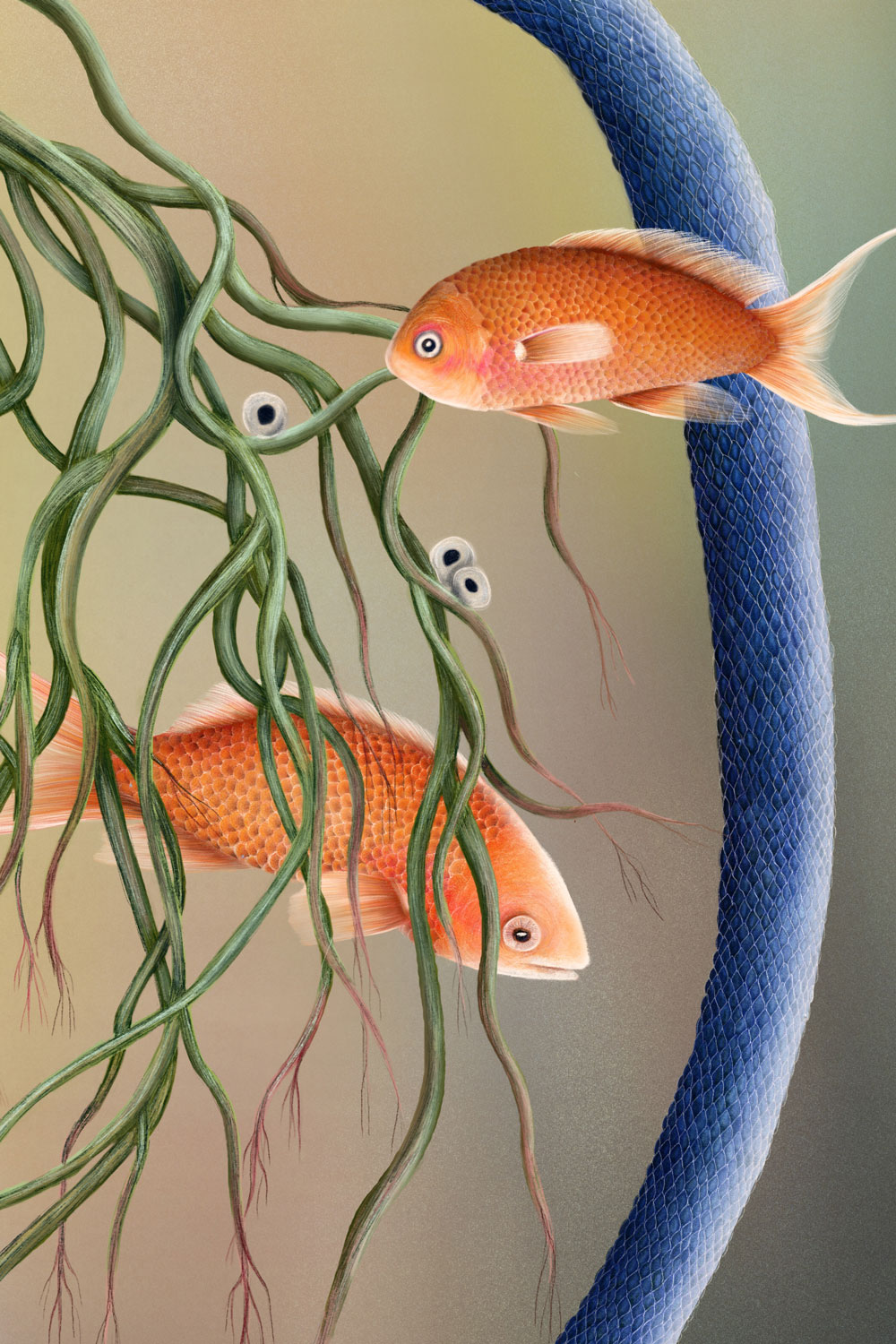
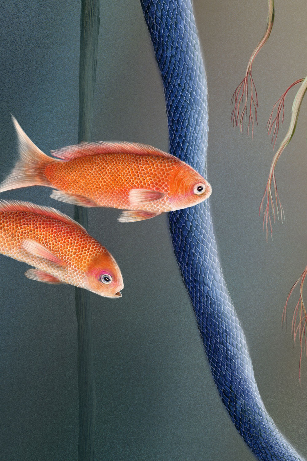
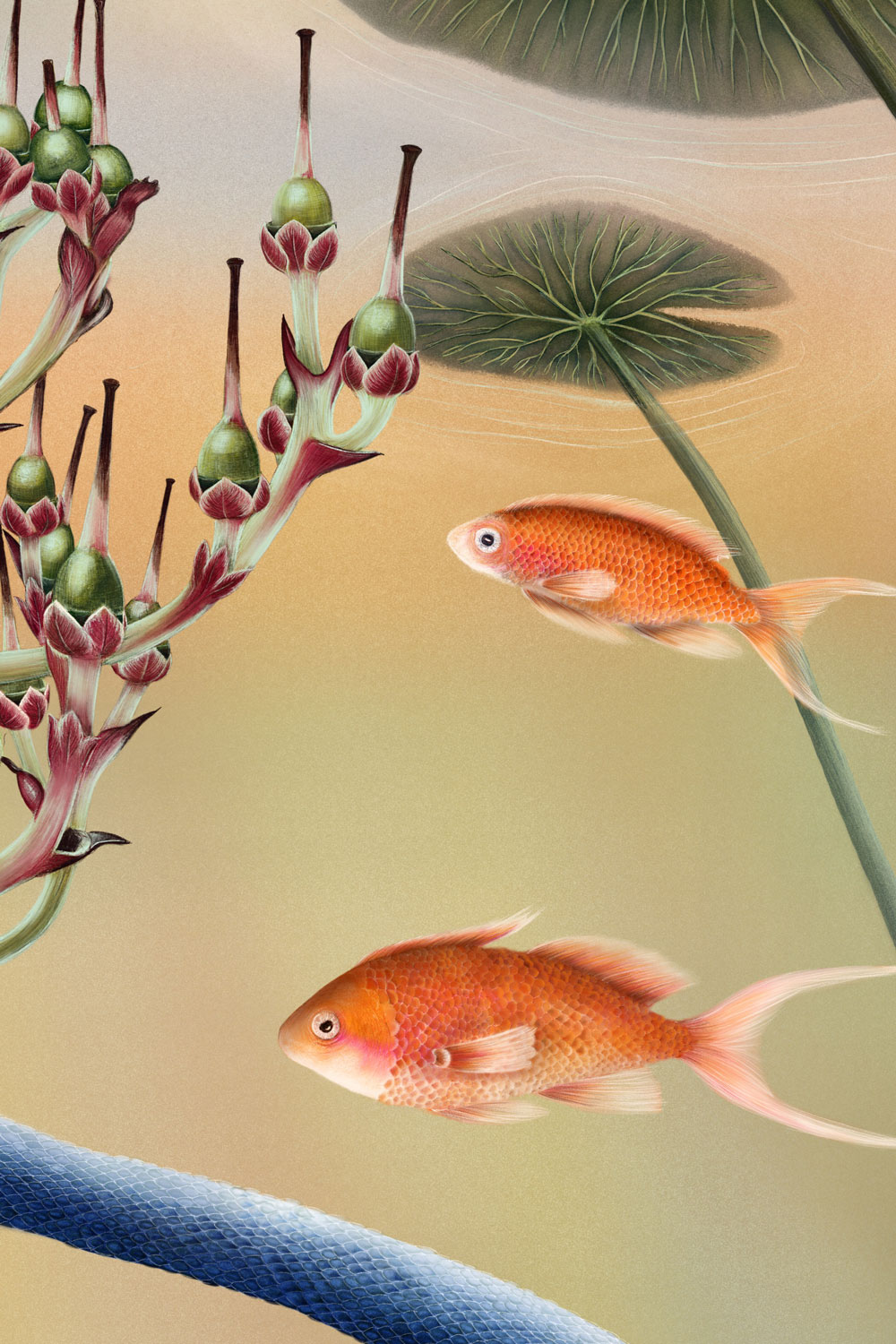
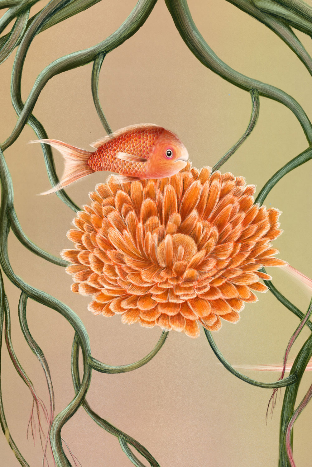
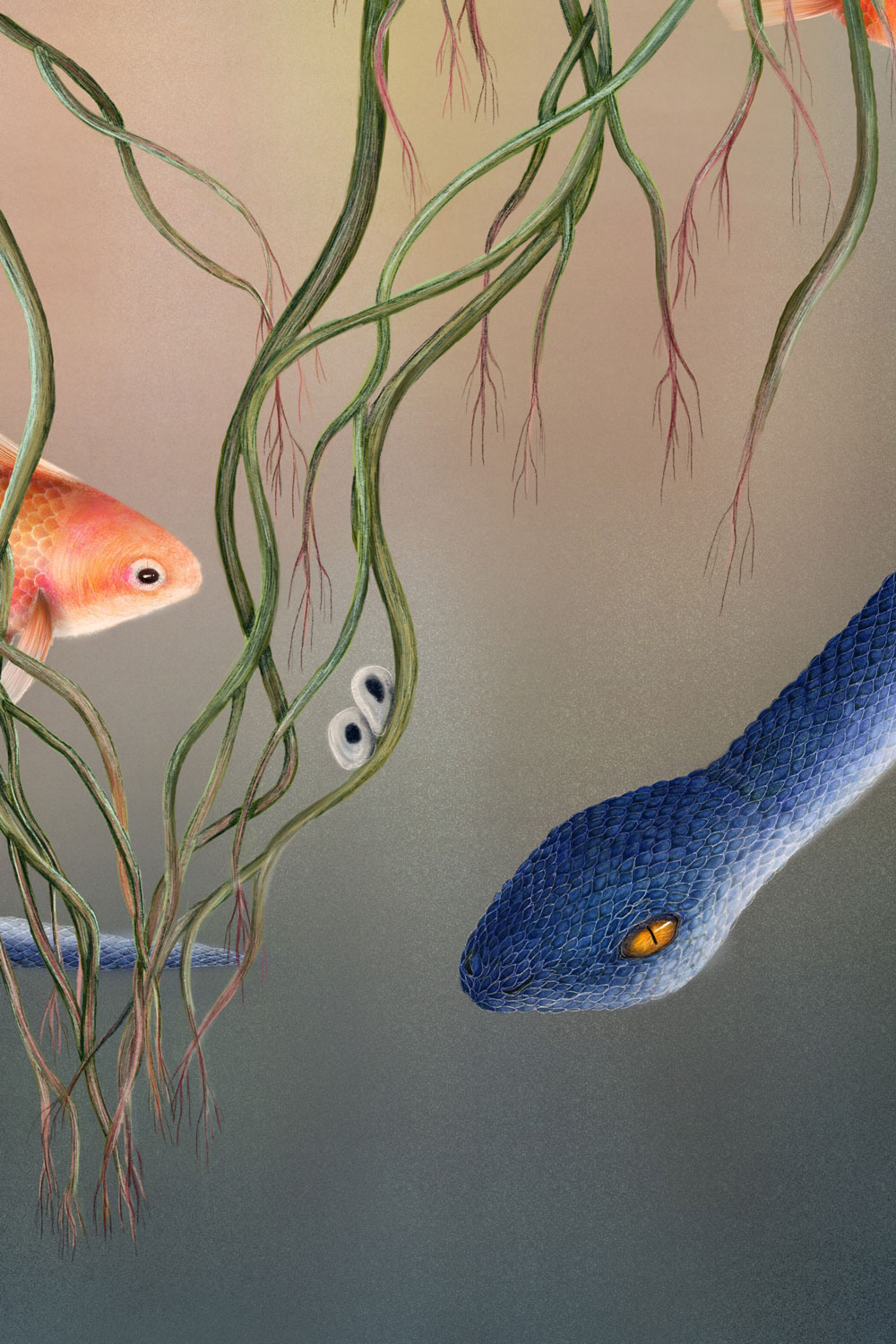
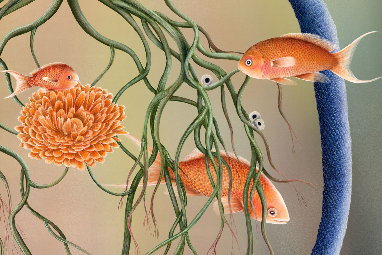
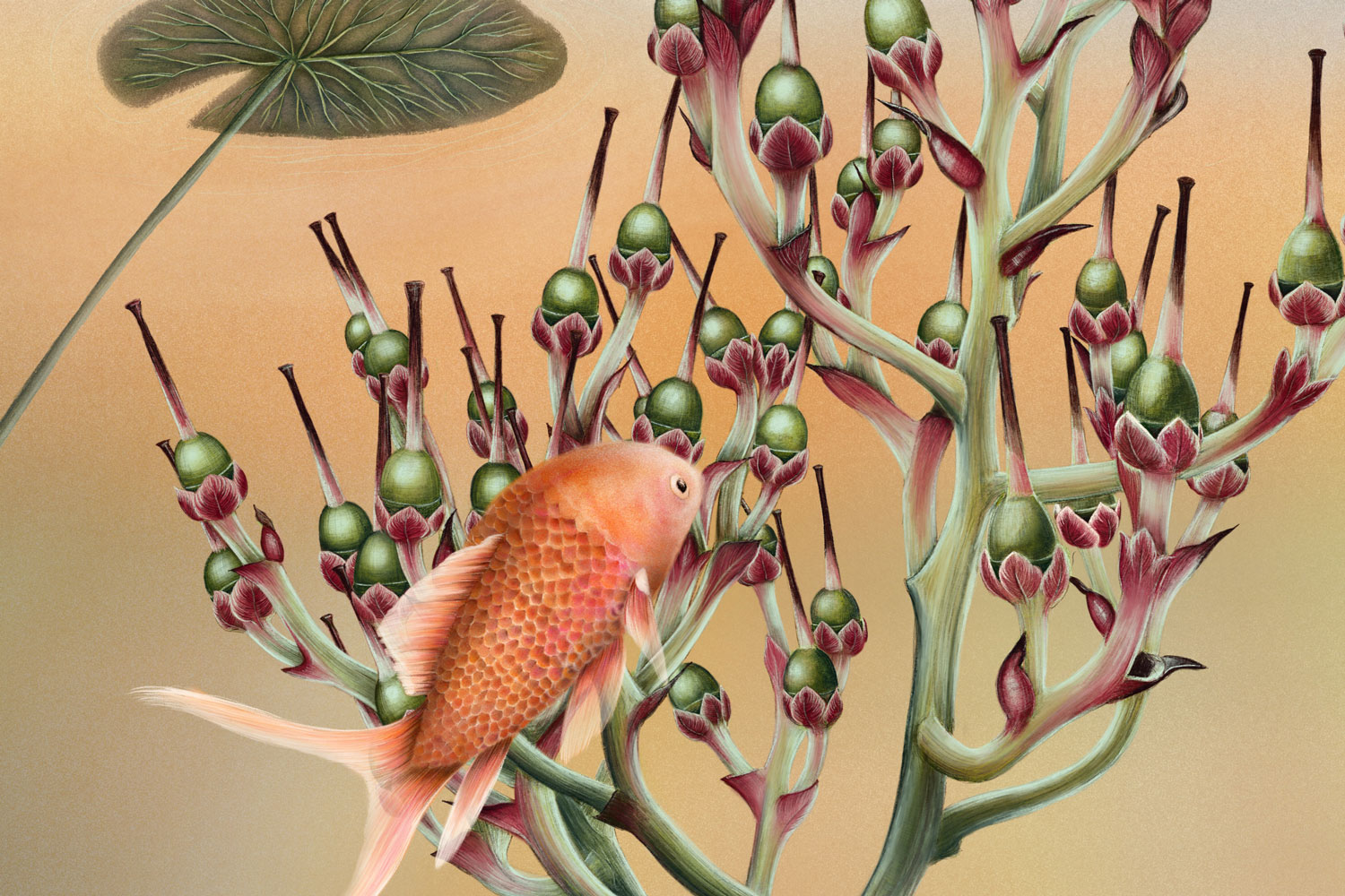
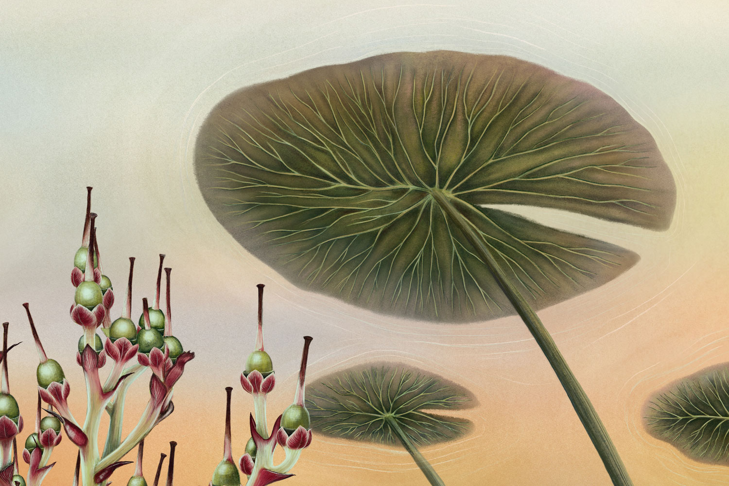
Artwork. The name Aziza comes from Arabic and means “the cherished” or “the beloved.” The painting explores trust, the trust that the right people (and souls) will find their way to us. It is about love in all its forms.
Fish represent beloved people and animals, the snake stands for death and farewell, and the fish eggs symbolize the future, the hope of meeting new beloved beings. Life and death exist side by side, intertwined in a quiet cycle. The plant at the center represents depth and a sense of safety, while the underwater atmosphere evokes a protected, peaceful space, a place of love, remembrance, and renewal.

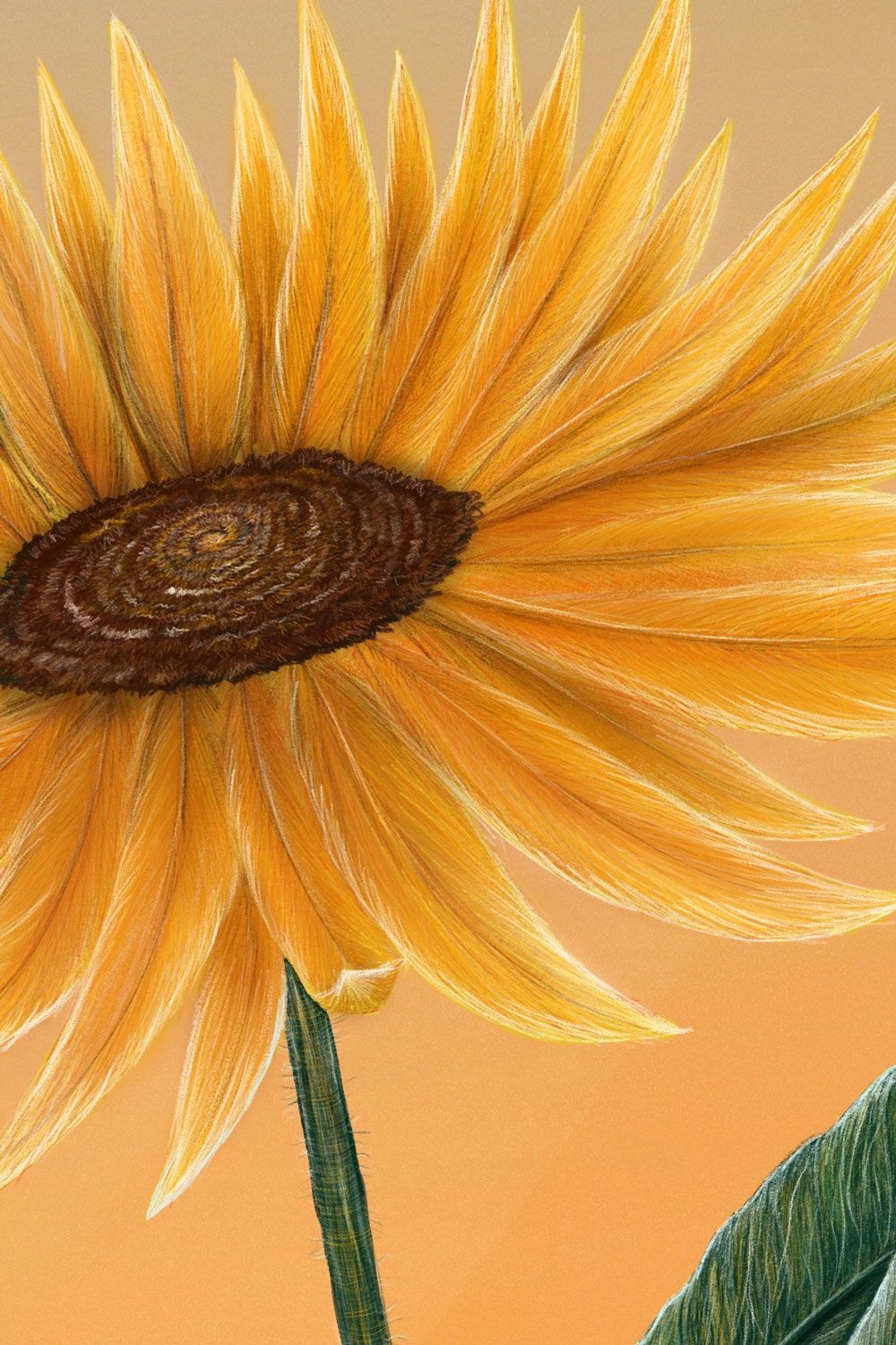
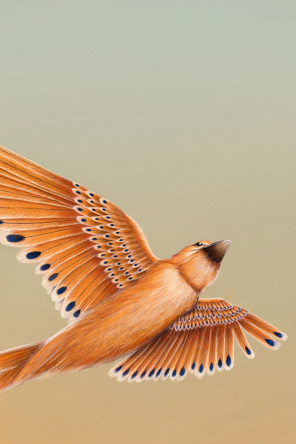
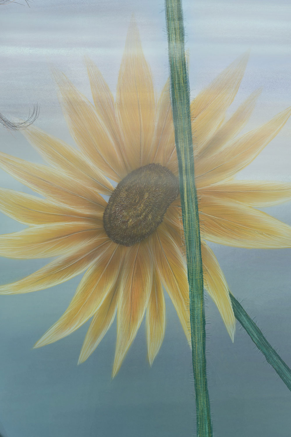
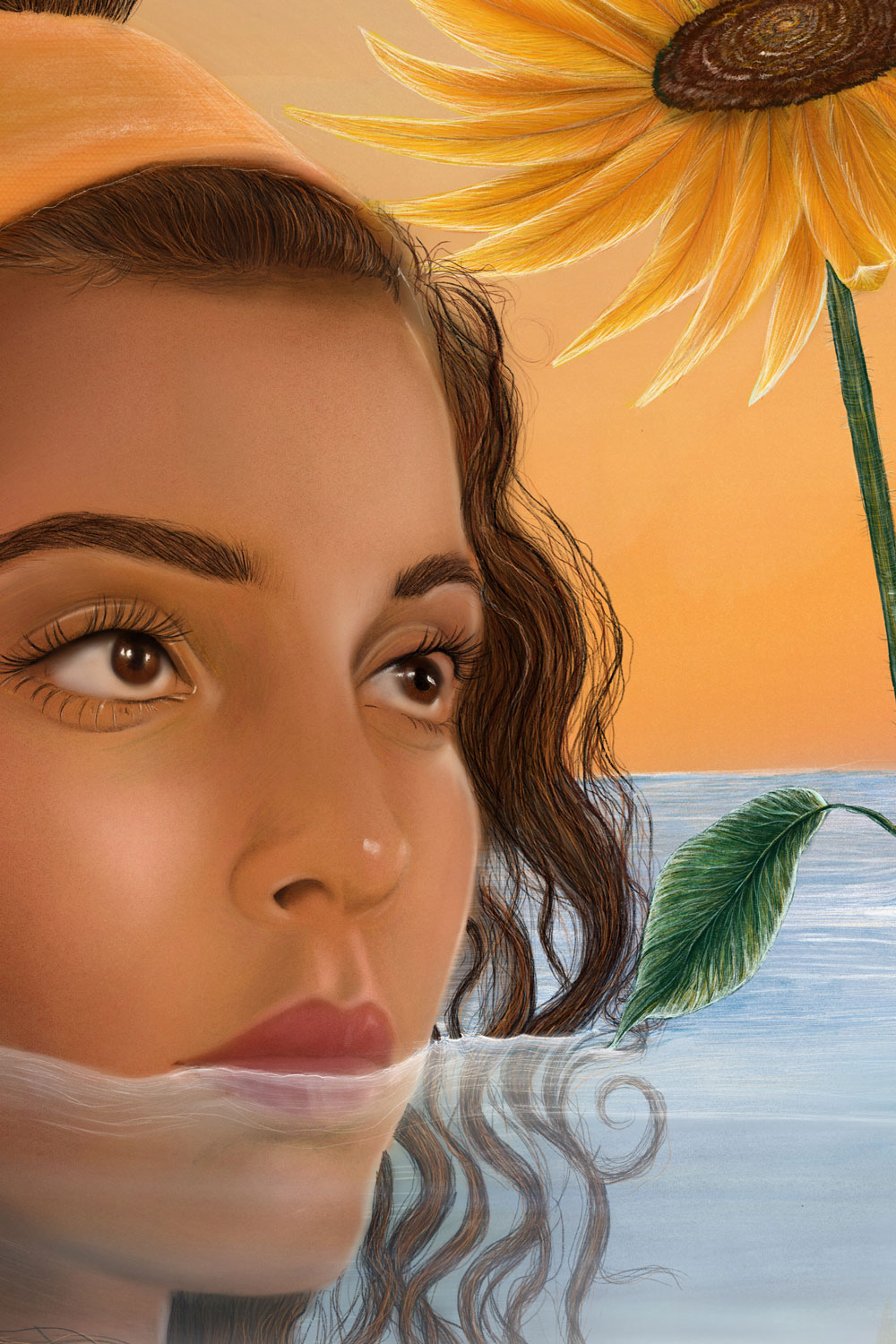
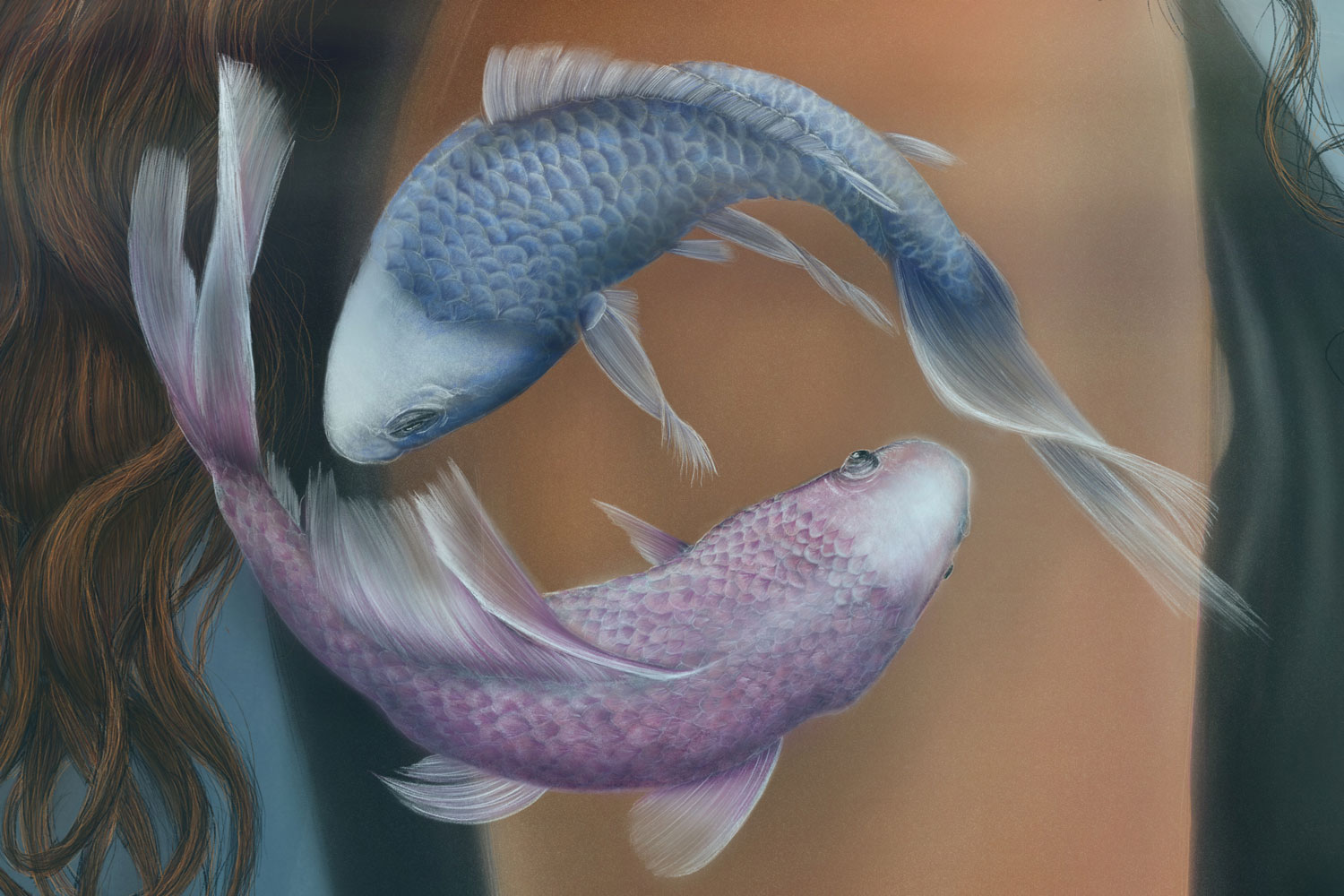
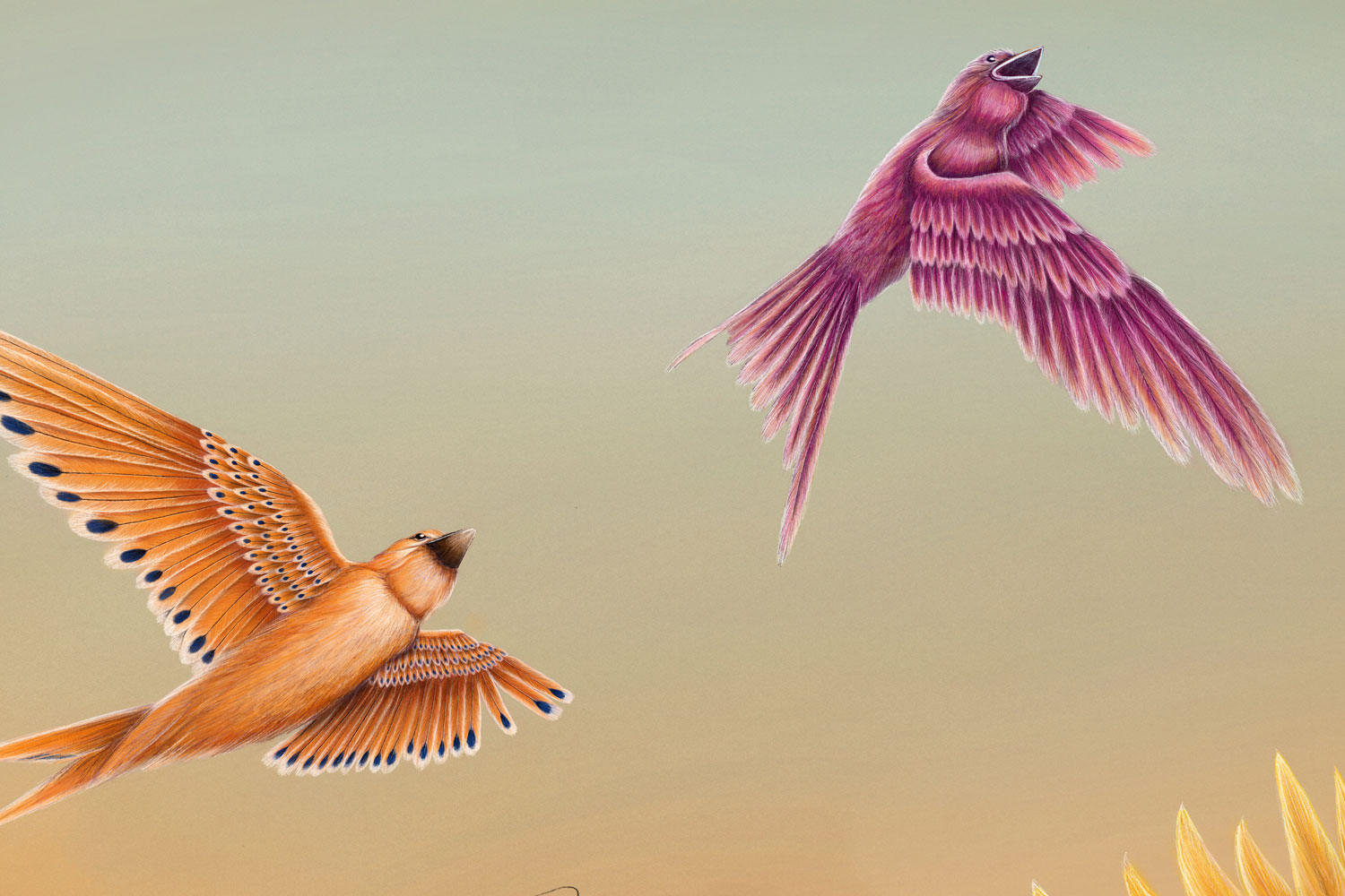
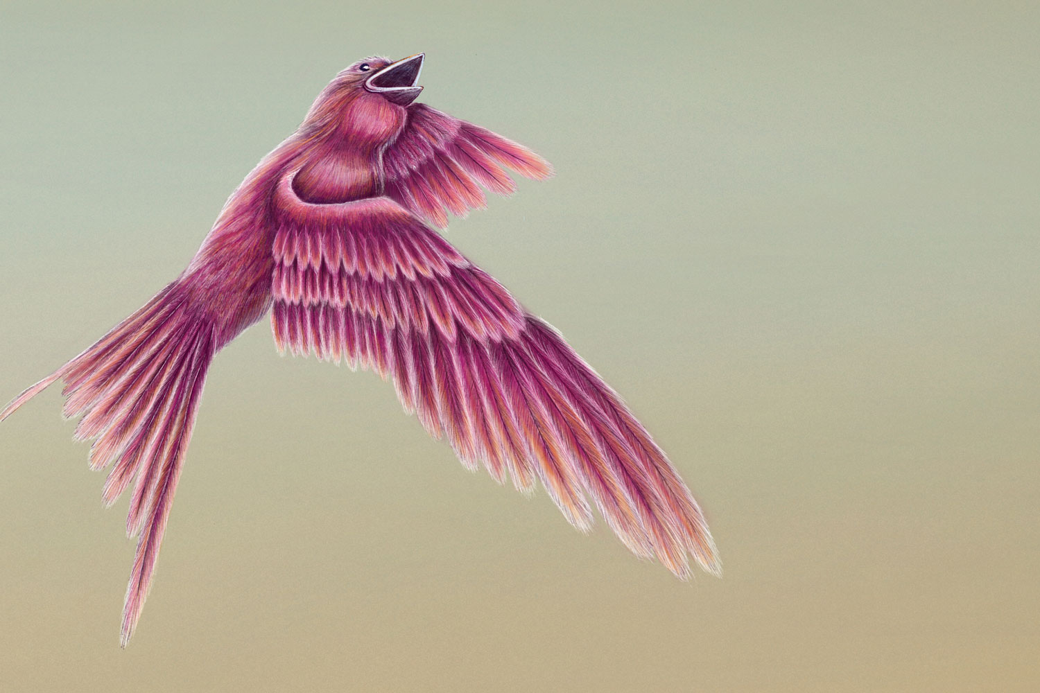
Artwork. “Las observaciones” was created during a phase in which I reflected a lot on my life and the people around me. The birds represent my desire for freedom, the fish symbolize the relationships in my environment, especially with my twin sister. The sunflowers represent turning toward one’s own light; they bloom and face the light even in difficult situations, while the water, reaching up to my lips, represents both the flow of life and its challenges. My portrait shows me in the midst of life: calm and focused despite all difficulties.

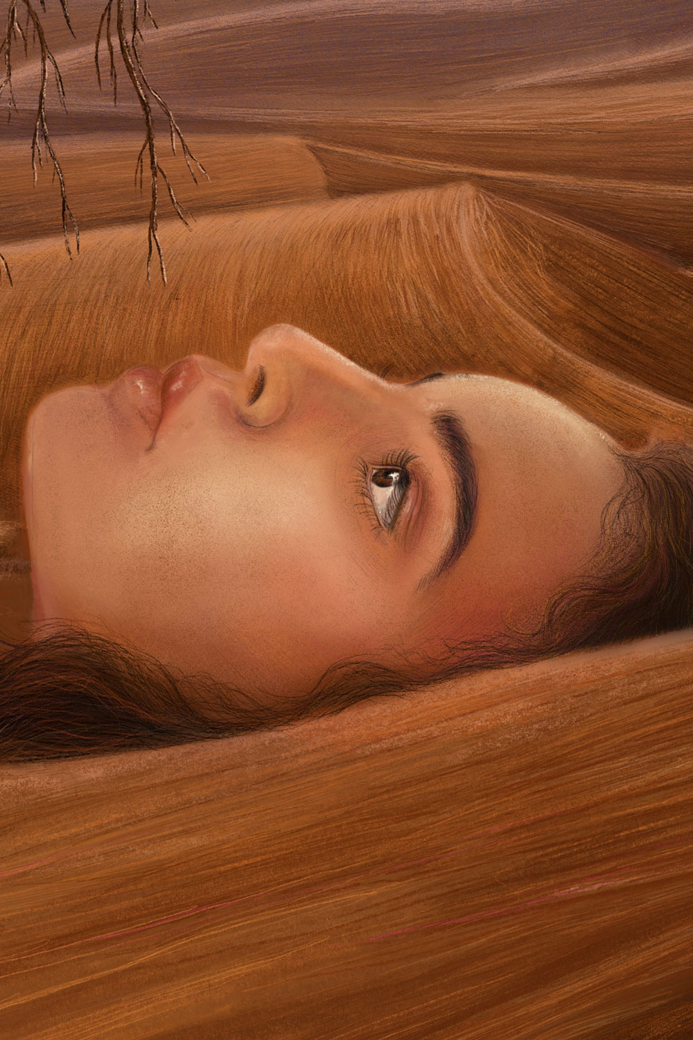
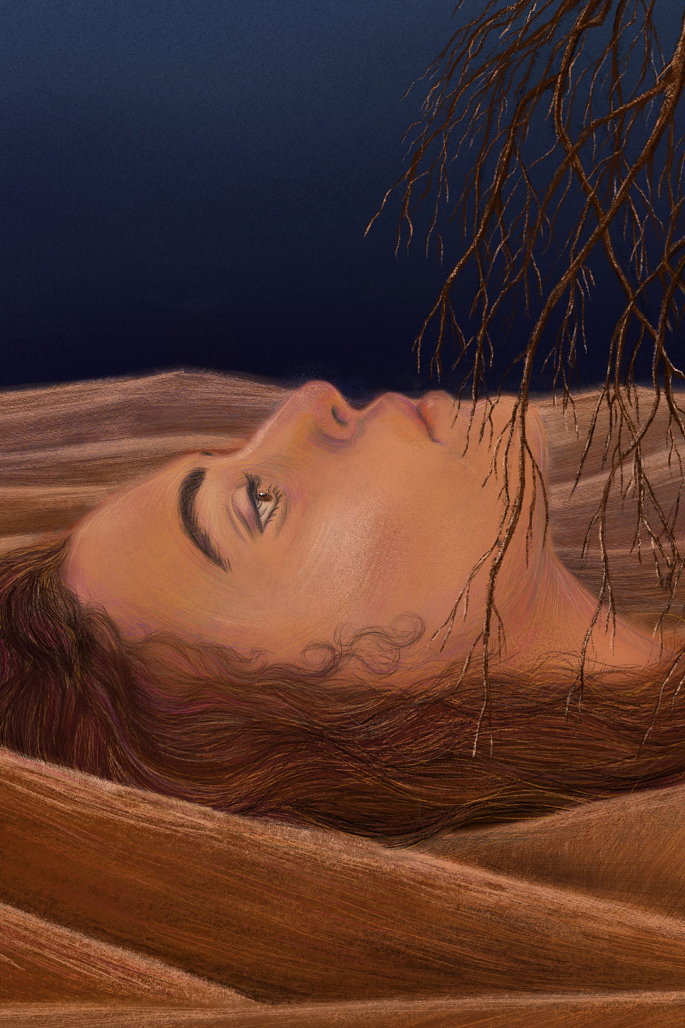
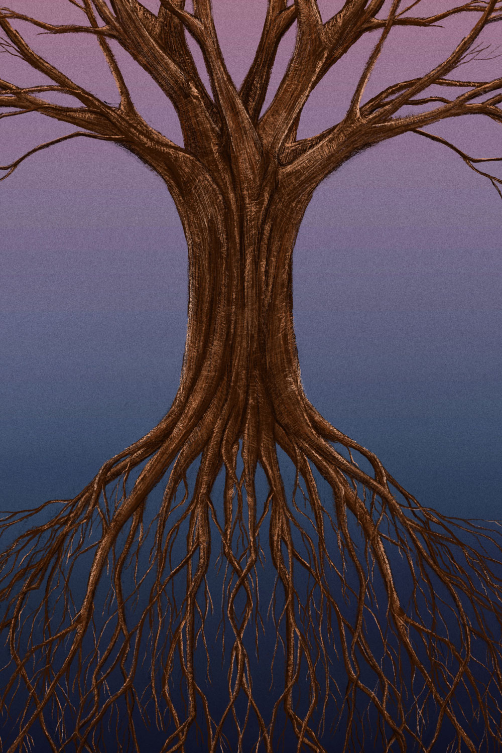
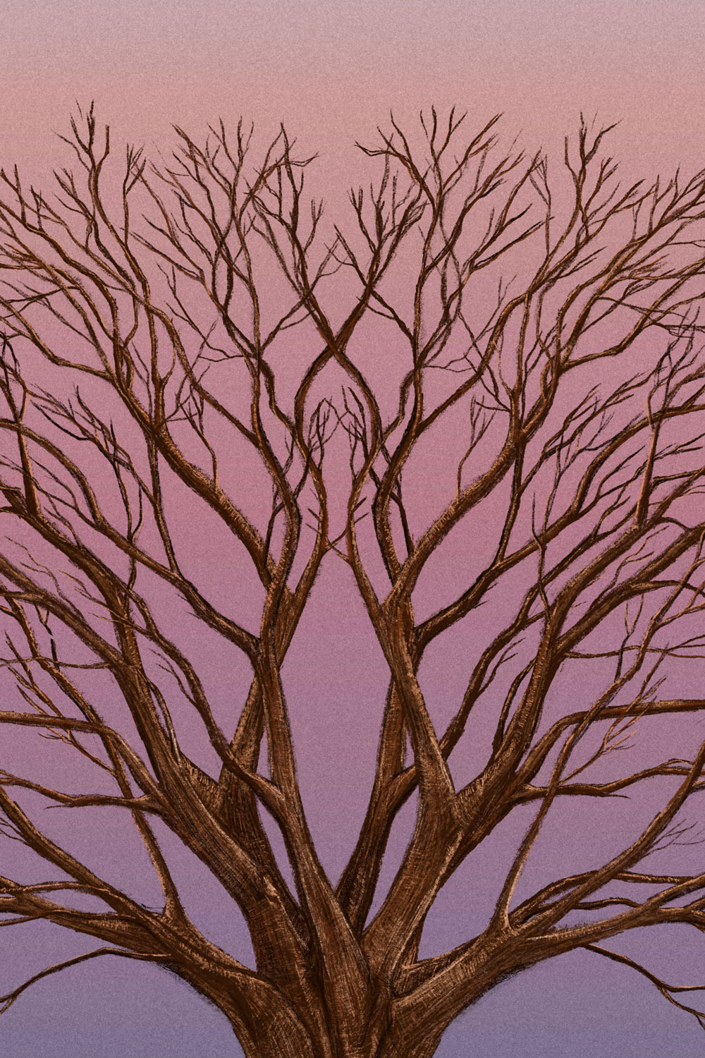
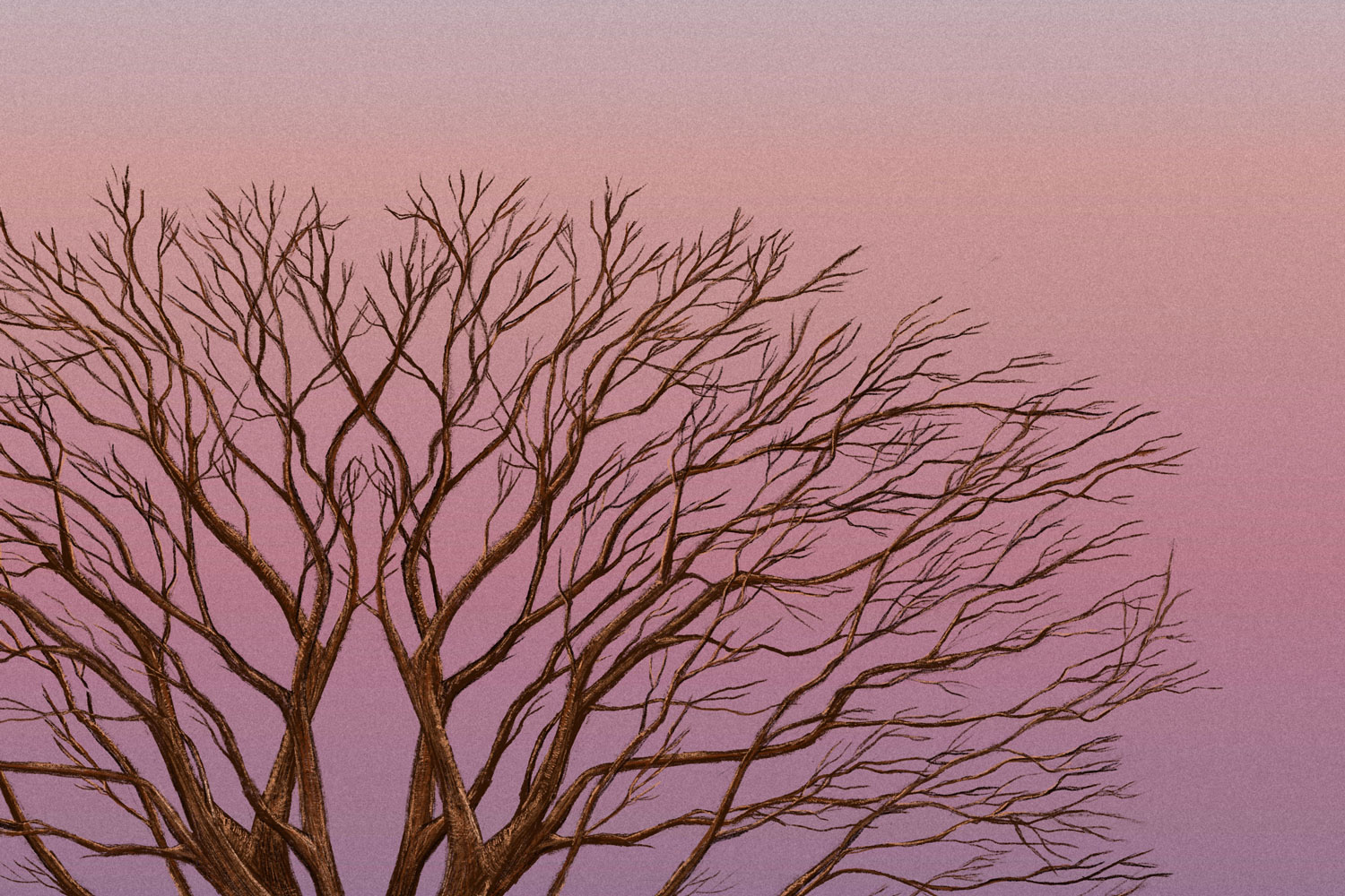
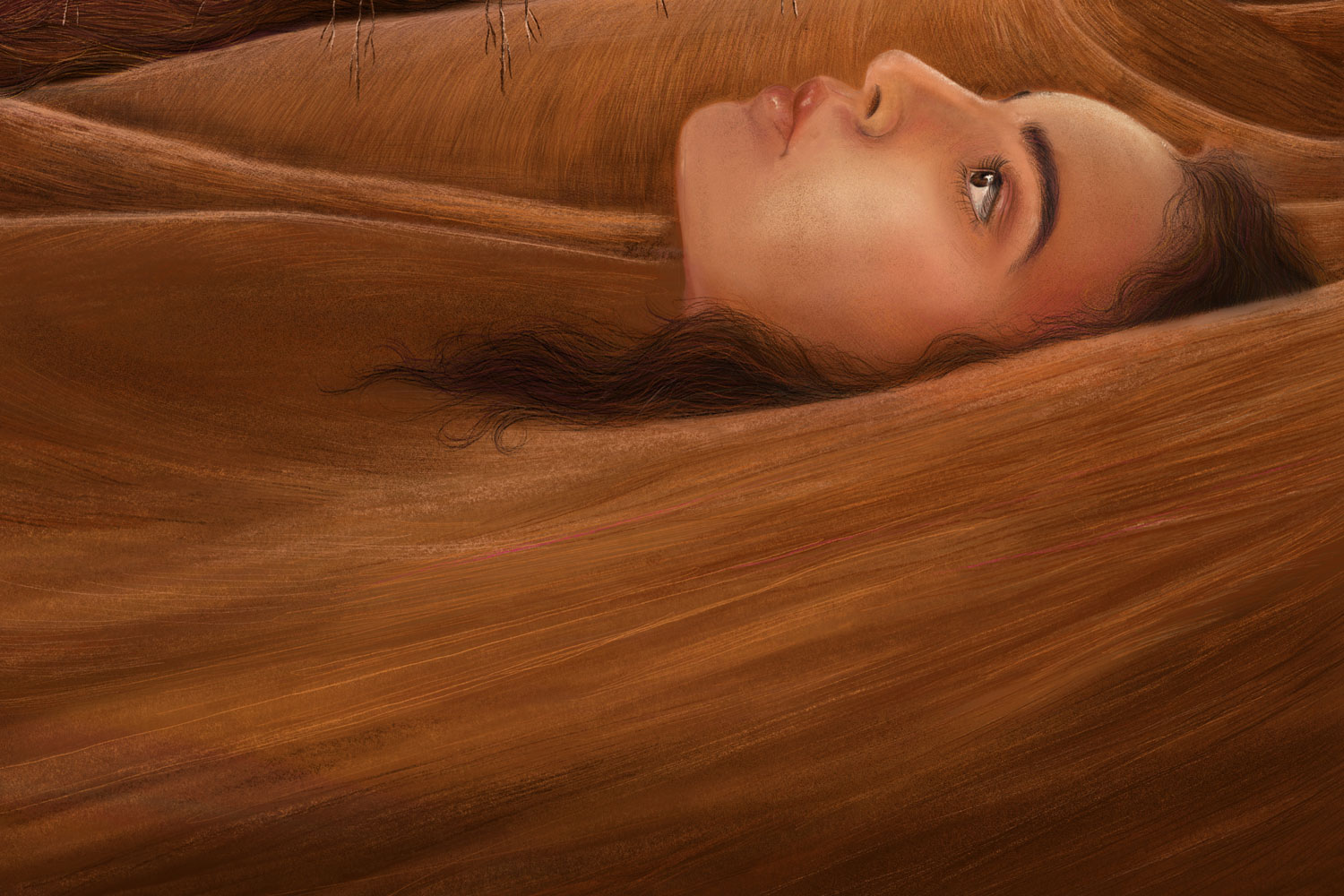
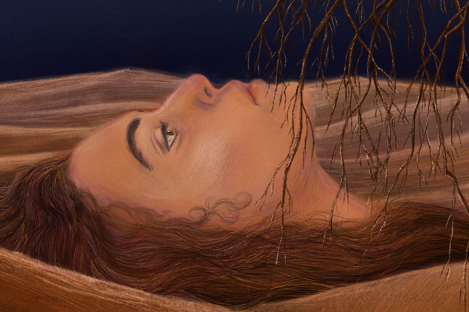
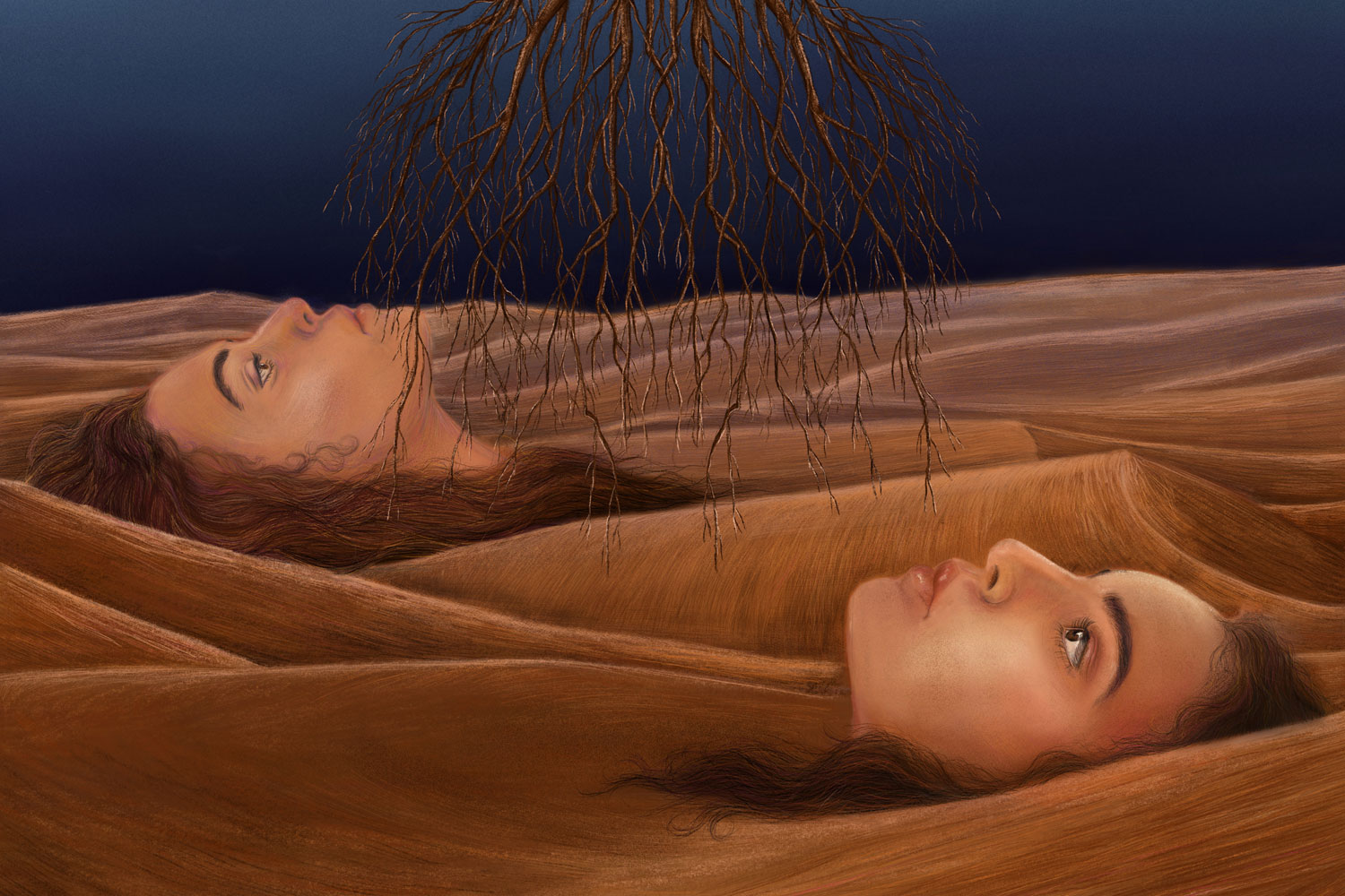
Artwork. Two faces, embedded in the desert sand. They represent my twin sister and me—two souls, but also two sides of the same story. Our hair merges with the dunes; for us, the desert represents our roots, a place of challenge, and inner silence all at once.
In the center floats an uprooted tree. It does not touch the ground. It symbolizes the sense of detachment that so many of us know. Yet, within this uprooting lies a hidden freedom: those who are not tied down can plant themselves anywhere. It is all a matter of perspective.

I look forward to the opportunity to contribute my creativity to your team!
A closer look at my design mindset