12 February 2026
More Than Just Icons
When people think about branding, they usually think of the logo first. It’s considered the central visual identifier of a brand — its symbolic core. But in everyday interactions, people often encounter other elements far more frequently: buttons on a website, navigation symbols in an app, small visual cues in presentations or on social media. This is where icons play a crucial role.

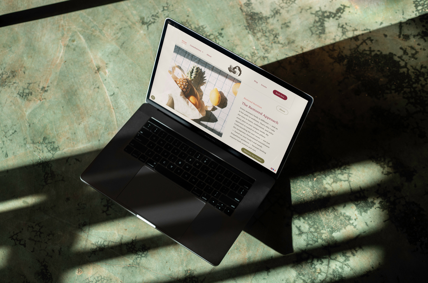
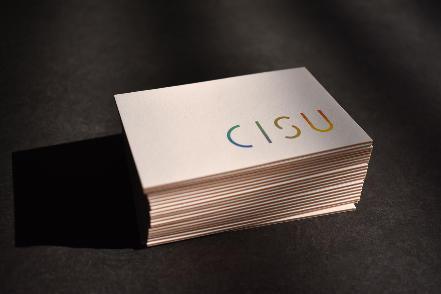
Custom Icons for CISU
Icons are not merely functional symbols meant to simplify information. They are part of a brand’s visual system. When they don’t align stylistically with the logo, color palette, or typography, the overall impression can quickly feel inconsistent or fragmented. Even if viewers can’t consciously articulate what feels off, they sense the lack of cohesion. As a result, the brand may appear less thoughtful and less professional.
That’s why icons should always harmonize with the existing design language. This applies to shape, line weight, level of detail, and color usage. A rounded, soft logo pairs more naturally with icons that have smooth, curved forms rather than sharp, rigid edges. A refined, elegant typeface works better with delicate line icons than with heavy, bold shapes. Even subtle differences can influence the overall perception because they shape the visual voice of the brand.
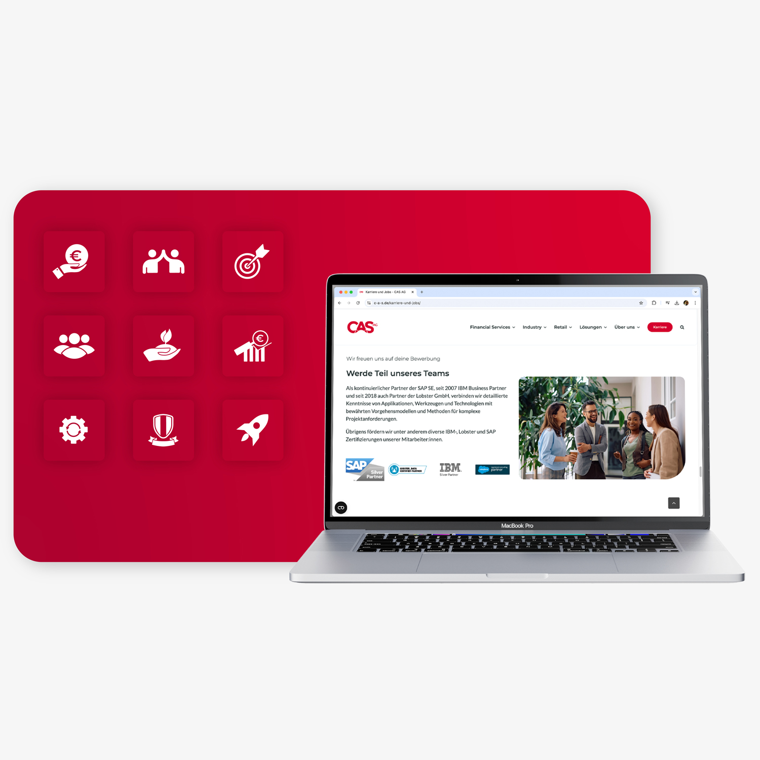
Custom Icons for CAS AG
Strategically, the logo remains the primary identifier of a brand. It represents the company externally and appears on contracts, profile images, and marketing materials. However, in digital environments, icons often shape the day-to-day brand experience. In apps, dashboards, or complex websites, users navigate through symbols. They repeatedly see, click, and interact with them — and unconsciously associate that visual style with the brand itself.
For digital products or design-driven companies in particular, icons can become almost as important as the logo. They communicate attitude, quality, and attention to detail. While standard icon libraries are functional, they often feel generic. When competitors use the same sets, differentiation becomes difficult. Custom-designed icons, on the other hand, create distinctiveness and signal that a brand has been thoughtfully crafted down to the smallest detail.


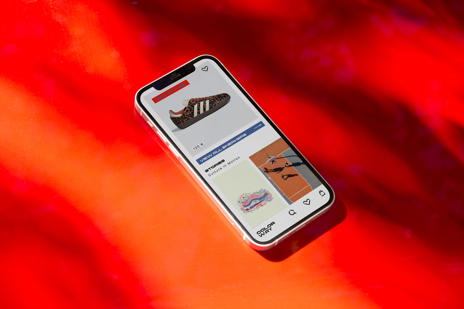
Custom Icons for Colorway
Ultimately, it’s not about making icons more important than a logo. It’s about understanding that strong brands are not built from isolated elements but from cohesive systems. Logo, color, typography, imagery, and icons work together. Only when everything aligns does a brand feel clear, consistent, and professional.
Icons are not decorative extras. They are subtle but powerful components of brand architecture.
Creative Practice
Selected Work